Designing AI interfaces: Challenges, trends & future prospects
If you’re building an artificial intelligence-powered product, understanding the nuances of designing effective AI interfaces is super-important. This guide will help you understand current challenges, recognize emerging trends, and leverage future possibilities.
You’ll gain valuable insights into:
- Overcoming usability issues with AI interfaces
- Common design patterns in AI products
- Best design practices for seamless AI integration
So, how do you design AI interfaces right?
The evolution of user interfaces
Before we discuss how AI-powered human-computer interactions look today, let’s take a step back to understand the evolution of user interfaces and the approach to their design.
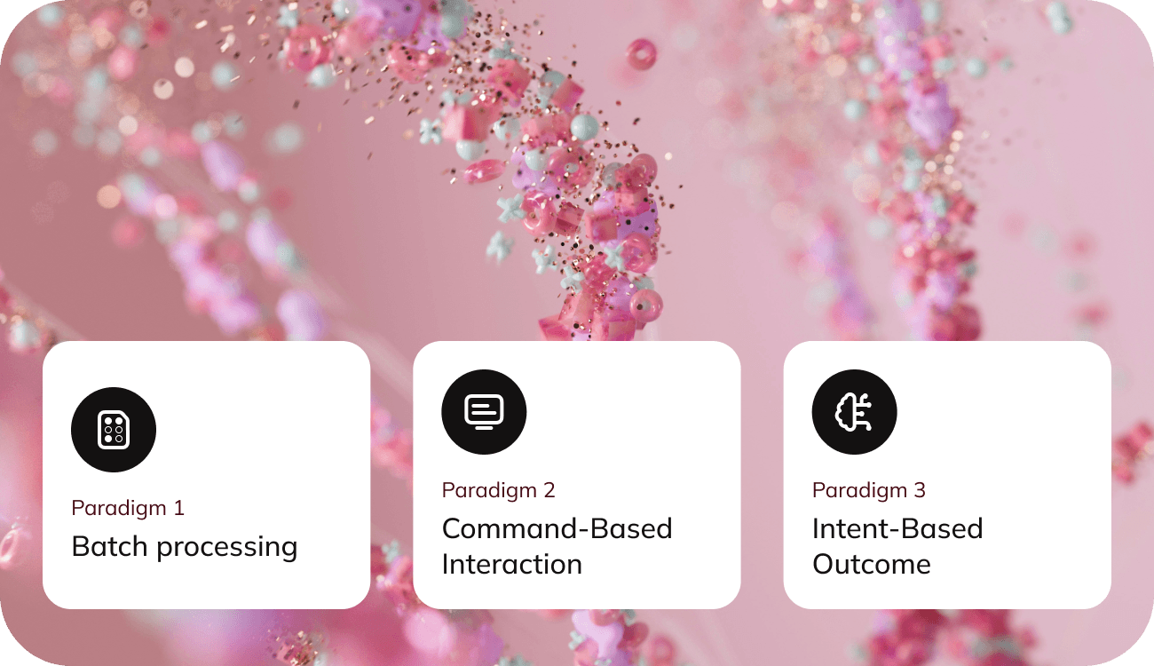
Punch card interfaces
Imagine a world where interacting with a computer required meticulously punching holes into stiff cards, each one representing a step in a complex process.
This was the reality in 1945, a time when computing was confined to the realm of experts and data centers. Users would prepare a batch of punched cards, submit them, and wait, often until the next day, to see if their instructions had been executed correctly. A single error could render the entire process futile, producing no output or meaningless results.
Command-line interfaces
Fast forward to 1964, and a revolution had begun.
The advent of the command-line interface transformed the way people interacted with computers. Instead of submitting a rigid set of instructions all at once, users could now input commands one by one and receive immediate feedback. This iterative process allowed for reassessment and adjustment, paving the way for more dynamic and interactive computing experiences.
Graphic user interfaces
The next leap forward came with the introduction of graphical user interfaces (GUIs).
These interfaces democratized computing, making it accessible to the masses. Users no longer needed to memorize and type complex commands; they could simply click and drag their way through tasks. This shift not only enhanced usability but also spurred the widespread adoption of personal computers.
Today: AI interfaces
Today, we stand on the brink of another transformative era in human-computer interaction.
Jakob Nielsen, a leading expert in web usability, posits that AI represents the next major user-interface paradigm.
Unlike previous interfaces that required users to specify detailed commands, AI focuses on understanding and fulfilling desired outcomes. Instead of instructing a computer to open a browser, search for a blog, and select an article, users will soon be able to simply express their intent, and the AI will handle the rest.
Problem: Usability issues of current implementation
However, the current state of AI interfaces is not without its challenges.
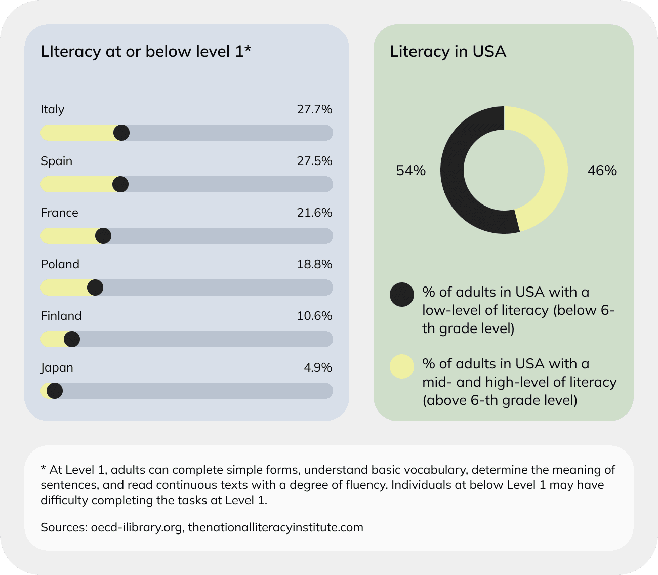
Most AI tools rely on prompt-based inputs, which can be a significant barrier for many users. Crafting effective prompts demands a high degree of articulation, a skill that a large portion of the global population lacks.
In fact, nearly half of the world’s adults are considered low- literacy users, with reading skills below a sixth-grade level. This issue is not confined to developing countries; in the United States alone, 54% of adults have a literacy below a sixth-grade level, from which 21% are functionally illiterate.
Even for those who are literate, creating precise prompts can be cognitively demanding and time-consuming. This situation mirrors the early days of command-line interfaces, where only those with specialized knowledge could effectively communicate with computers.
Just as those interfaces required trained query specialists, today’s AI systems often necessitate the expertise of prompt engineers to yield the best results.
Solution: Hybrid interfaces
Looking ahead, the future of AI promises a more intuitive and accessible user experience.
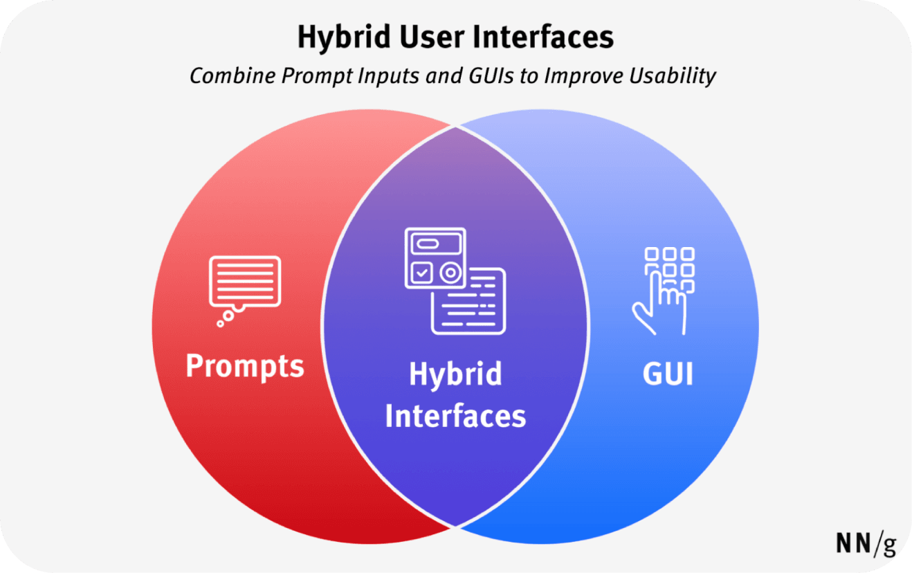
We are moving towards hybrid interfaces that combine the powerful capabilities of conversational AI with the user-friendly nature of graphical interfaces. Major tech companies like OpenAI, Google, and Apple are already showcasing how these integrations can look, blending AI’s intent-based functionalities with familiar, easy-to- use graphical elements.
These advancements will not only make AI more accessible but also seamlessly integrate it into our daily workflows.
Imagine a world where your computer understands your needs with minimal effort on your part, allowing you to focus on your goals rather than the mechanics of achieving them. The future of human-computer interaction is bright, and it’s poised to make technology more intuitive and inclusive than ever before.
AI interface design: Opportunities and challenges
The advent of AI opens a world of exciting opportunities for human-computer interaction, but it also presents new challenges for UX designers.
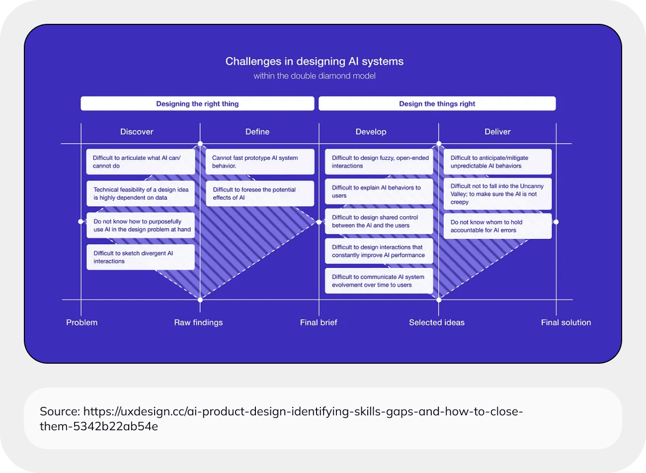
To harness AI effectively, designers must become well-versed in core machine learning concepts, understanding both the capabilities and limitations of these systems. This knowledge will enable them to identify user needs that AI can address and to continuously revisit and reassess these needs as AI technology rapidly evolves.
Designing for AI involves accommodating a probabilistic system that can produce unexpected or unexplainable results. This means designers can’t plan for every possible scenario in the user journey. Instead, they must collaborate closely with engineers to shape the potential outputs, ensuring that the results align with user expectations and requirements.
The traditional definition of a Minimum Viable Product (MVP) often shifts in the context of AI-driven products. A beautiful and user-friendly interface is meaningless if the AI system’s output doesn’t deliver value to the user.
Therefore, the primary focus should be on the quality and relevance of the AI’s output. Once this foundation is solid, designers can then build a compelling and usable product around it.
Visual language of AI
As AI rapidly gains traction in the digital world, companies are eager to integrate AI into their products or develop AI-centric solutions. This rush has led designers to emphasize AI capabilities and create distinctive visual identities.
Interestingly, there are noticeable trends in how AI is presented across various products.
Color trends
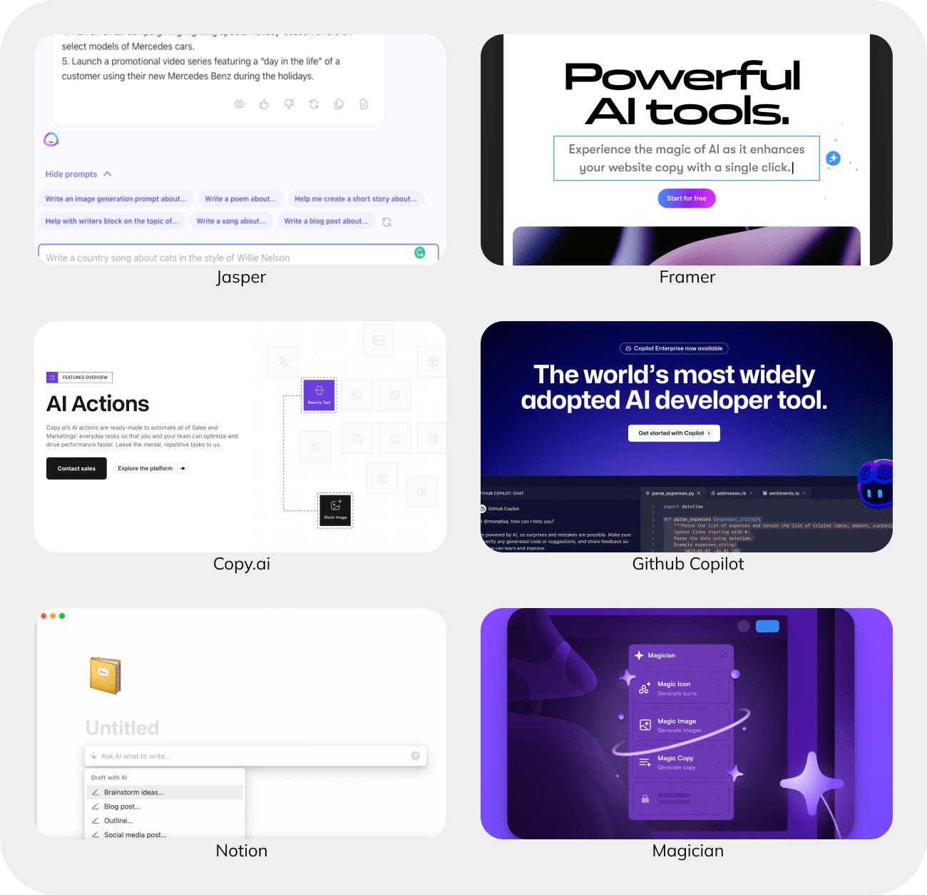
A striking trend in AI design is the prevalence of purple and purple-ish gradients.
Purple, adjacent to the commonly used blue, offers a sense of familiarity while remaining distinct and rarely used in other interfaces. The AI boom coincided with the rise of the Linear app, which prominently features purple, further cementing its association with AI.
This phenomenon mirrors the earlier trends seen during the cryptocurrency and NFT surge, where purple and gradients were similarly used to signal something new and innovative. AI-focused companies like Jasper and Copy.ai have adopted purple as their primary branding color, while others like Notion and Figjam use purple to highlight AI features. GitHub Copilot and Dora AI employ gradients to convey modernity.
While this trend is prevalent, some products are beginning to forge their own identities, moving away from the purple and gradient dominance. Companies like Musho, Reword, and Hume AI have developed unique branding that diverges from the current trends, suggesting a sense of permanence and individuality.
Iconography
For many established products, integrating AI features is more subtle.
Instead of overhauling their design, they incorporate AI through nuanced elements like iconography and loading animations. Figma and Apple exemplify this approach, seamlessly blending AI capabilities into their existing interfaces without overwhelming the user with bold colors or dramatic changes.
In terms of iconography, sparkling stars have emerged as a popular indicator of AI features. Companies like Gemini and Story.com have integrated these stars into their logos. Traditional icons are often embellished with sparkling stars to subtly signal AI functionalities.
Additionally, orbs and robots are frequently used to represent AI assistants and co- pilots. Notable examples include GitHub Copilot, Character.ai, and Spotify’s DJ agent. These symbols effectively communicate the supportive and interactive nature of AI.
![]()
Common design patterns in AI products
User input
Open ended prompt input
Prompt input remains the most popular way to harness AI capabilities, offering users the freedom to input any query or command. However, this freedom can also be overwhelming due to the sheer number of possibilities. To enhance the user experience and mitigate this challenge, several strategies can be implemented.
- Firstly, providing examples can help users understand how to effectively interact with the AI. By showing concrete instances of prompts and their outcomes, users can better grasp how to phrase their inputs.
- Another useful approach is offering templates. Templates can serve as starting points, guiding users on how to structure their requests and enabling them to modify these templates according to their specific needs.
- Additionally, interactive tutorials can significantly lower the barrier for new users. These tutorials can walk users through the process of crafting prompts and exploring AI features, making the learning curve less steep. For advanced users, such tutorials can introduce new functionalities and capabilities, keeping them engaged and informed.
By incorporating these strategies, the prompt input experience can be made more intuitive and user-friendly, catering to both novices and experienced users alike.
Omnichannel input
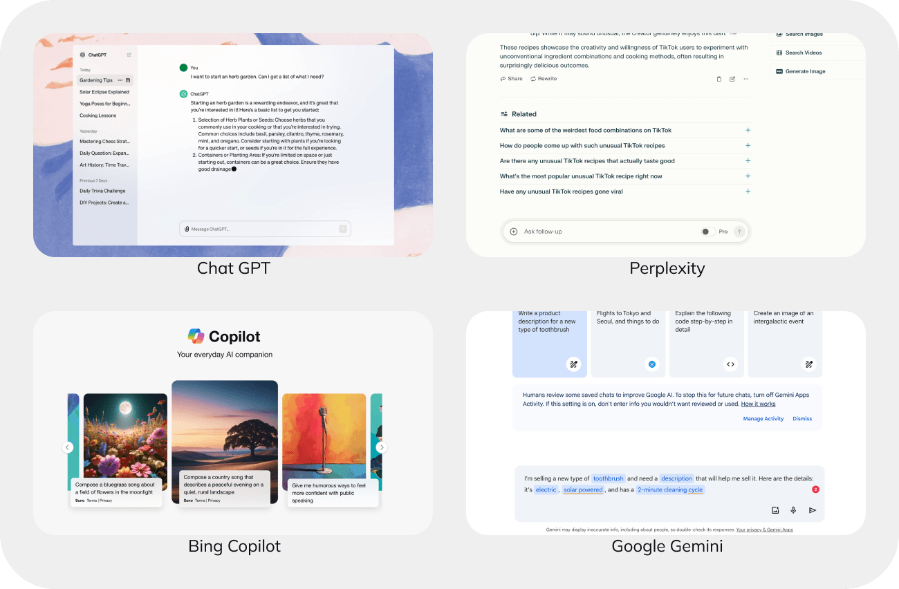
Modern AI models are omnichannel, capable of processing inputs in various formats beyond just text. To fully leverage these capabilities, apps should accommodate diverse user preferences for content submission.
By offering multiple input methods, such as direct uploads, recording tools, link integration, and drag-and-drop interfaces, users can choose how they want to provide their content.
This flexibility not only caters to individual preferences but also significantly enhances the overall user experience. Whether a user wants to upload a file, record audio, link to external content, or simply drag and drop items, having these options available ensures that interacting with the AI is seamless and intuitive.
Providing such varied input methods allows users to engage with AI in the way that best suits their needs, ultimately making the technology more accessible and user-friendly.
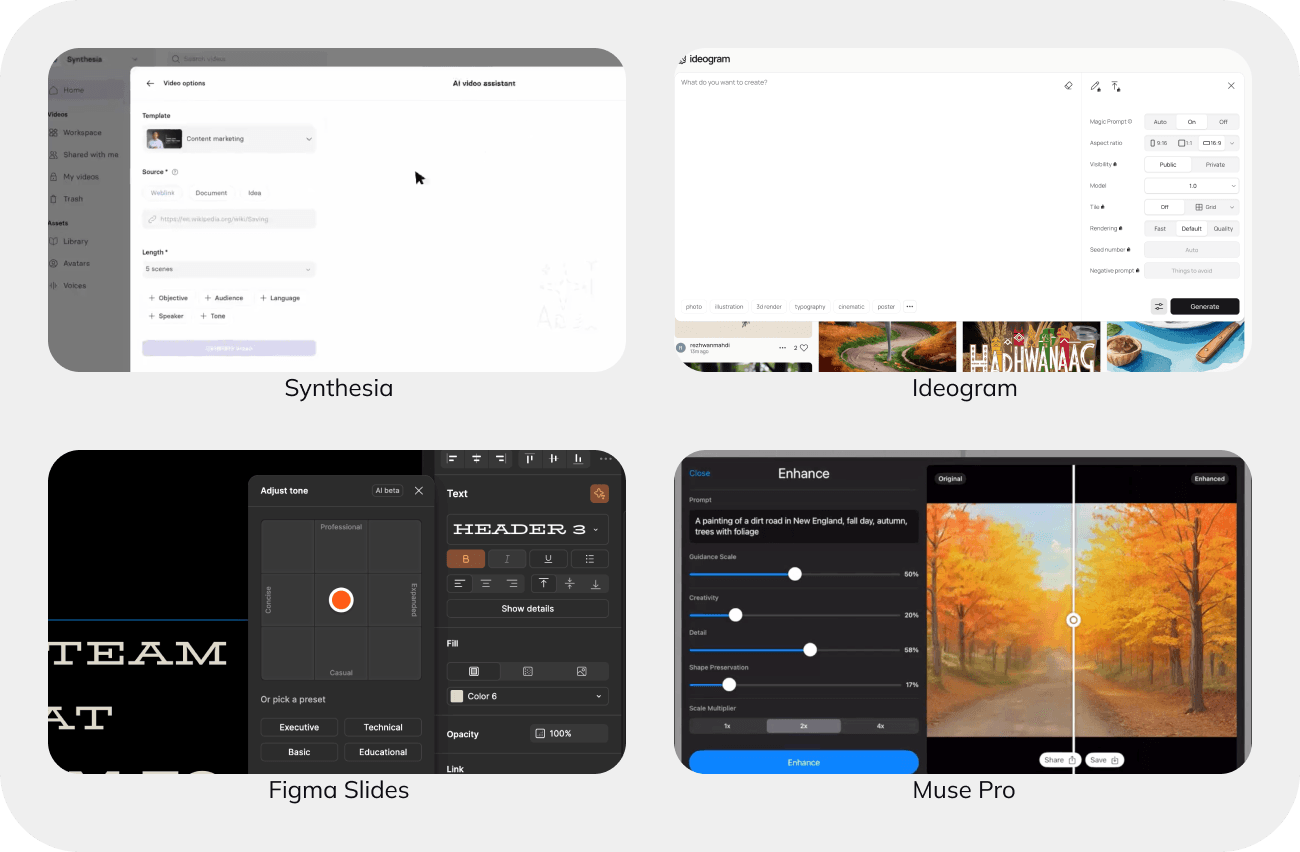
Structured input with form
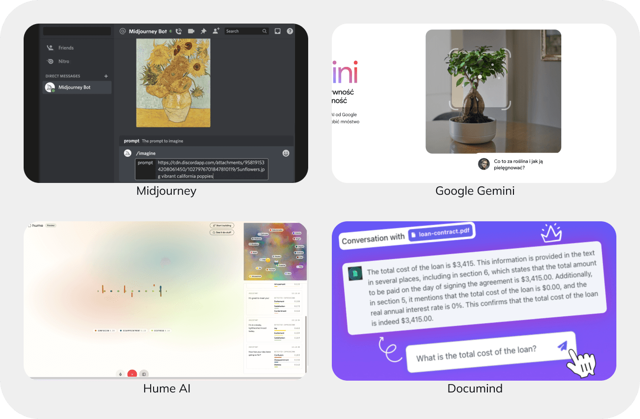
Users often struggle to provide AI with comprehensive and organized information, which can lead to less accurate responses, especially in more complex tools.
Implementing structured input can alleviate this issue by breaking down the required data into smaller, manageable chunks.
Structured input guides users through the process with clear steps, helping them understand what specific information is needed. This can be achieved through various elements such as
- input fields,
- dropdown menus,
- checkboxes,
- scales, and
- other adjustable components.
By offering these structured options, users are less likely to make errors, resulting in more relevant and predictable AI outcomes.
This approach not only simplifies the data entry process for users but also enhances the overall effectiveness of AI, ensuring that the responses generated are accurate and tailored to the user’s needs.
Selecting existing content
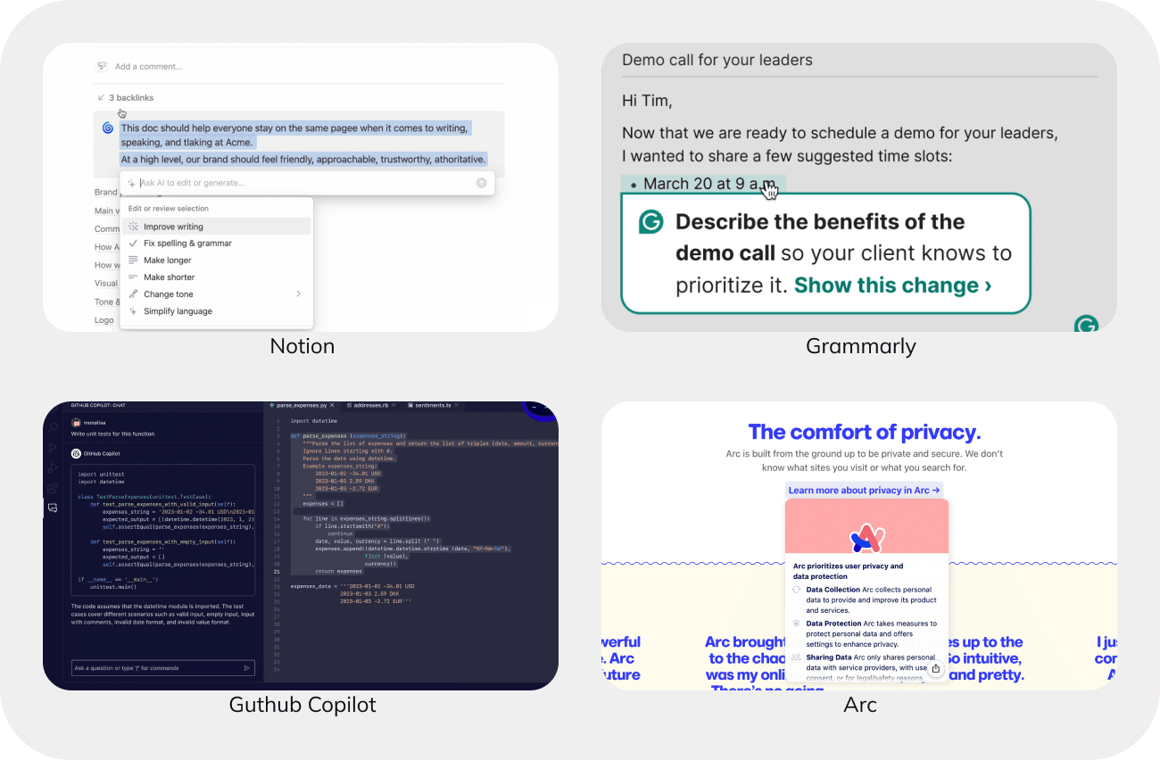
Integrating AI with existing products opens up new possibilities, particularly in leveraging context.
In tools like Notion and VS Code, users can select text and choose or type commands such as “summarize” or “translate.” This functionality eliminates the need to create inputs from scratch, significantly speeding up AI interactions.
Another implementation of this idea is within structured content. For instance, Framer offers AI options through a right-click menu within a frame, while Arc provides AI-generated summaries when hovering over a link.
These contextual integrations streamline the user experience by making AI tools more accessible and intuitive, ultimately enhancing productivity and interaction.
Loading results
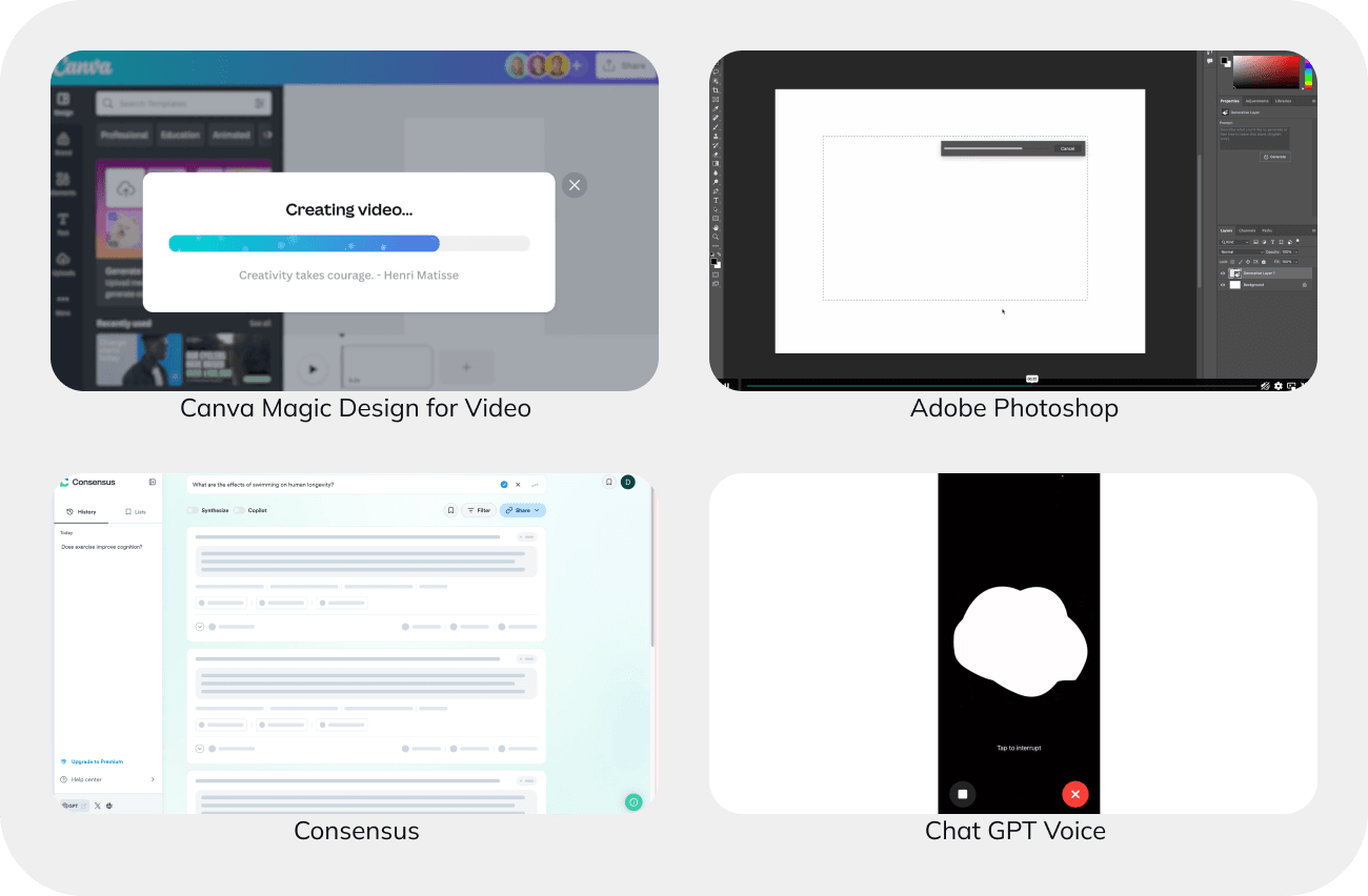
Users can quickly become confused or frustrated if a loading indicator isn’t visible, often assuming the app has frozen.
Traditional looped animations without clear progress indication are generally inadequate for AI applications, especially for tasks taking longer than five seconds. To address this, AI tools have adopted various tactics to show progress and ease user concerns.
Progress indicator
In the world of AI, borrowing strategies from other successful apps has proven to be a smart move.
One familiar tactic is the progress indicator, a simple yet powerful tool that shows users how much of their task is completed. This visual reassurance that things are moving forward—even if slowly—encourages patience and keeps frustration at bay.
Showing partial results
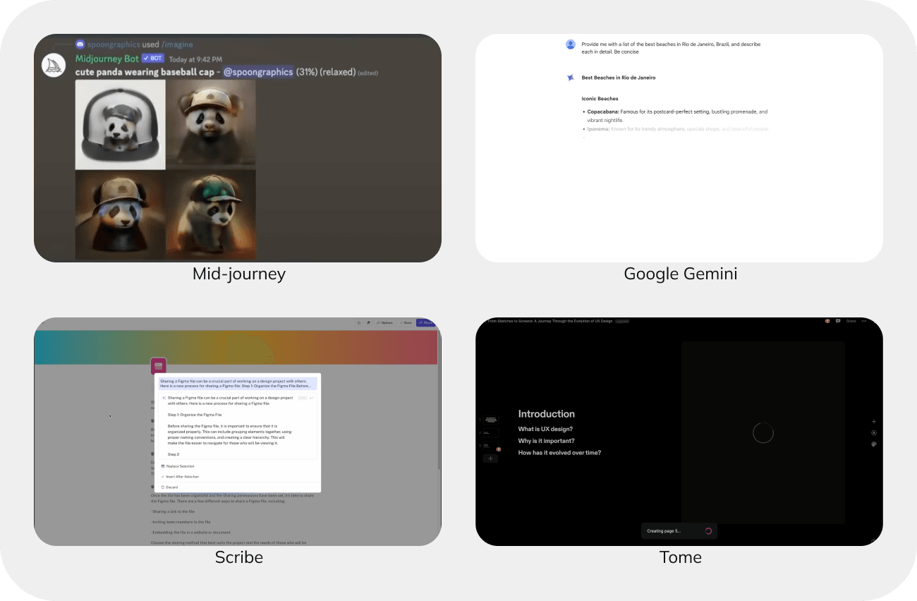
Midjourney and ChatGPT have taken this a step further, creating a more dynamic user experience. Instead of merely waiting for a task to finish, they let users peek behind the curtain.
Midjourney, for instance, offers snapshots of its creative process, allowing users to see a blurred preview of their results as they evolve. ChatGPT delivers answers word by word, enabling users to start reading and engaging with the content almost immediately. This not only makes the waiting time feel shorter but also gives users the power to stop and tweak their prompts, making the entire process more interactive and efficient.
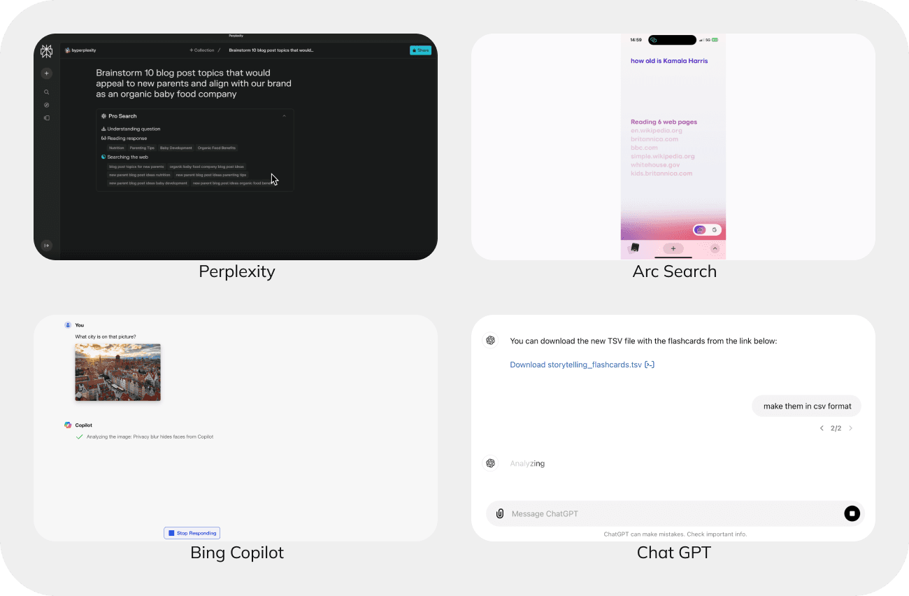
Updates on a current action
Some AI applications go even further, needing to fetch information from external sources or perform web searches. These steps can add significant time to the process, and it’s not feasible to generate intermediate results.
To manage user expectations and keep them informed, providing progressive updates about these background activities— such as showing the number of pages searched—can make the wait more tolerable and transparent.
Presenting AI results
The way AI presents results varies widely, depending on the context and the type of application. We’re witnessing an evolution where some presentation patterns are gaining traction, while others are fading into away.
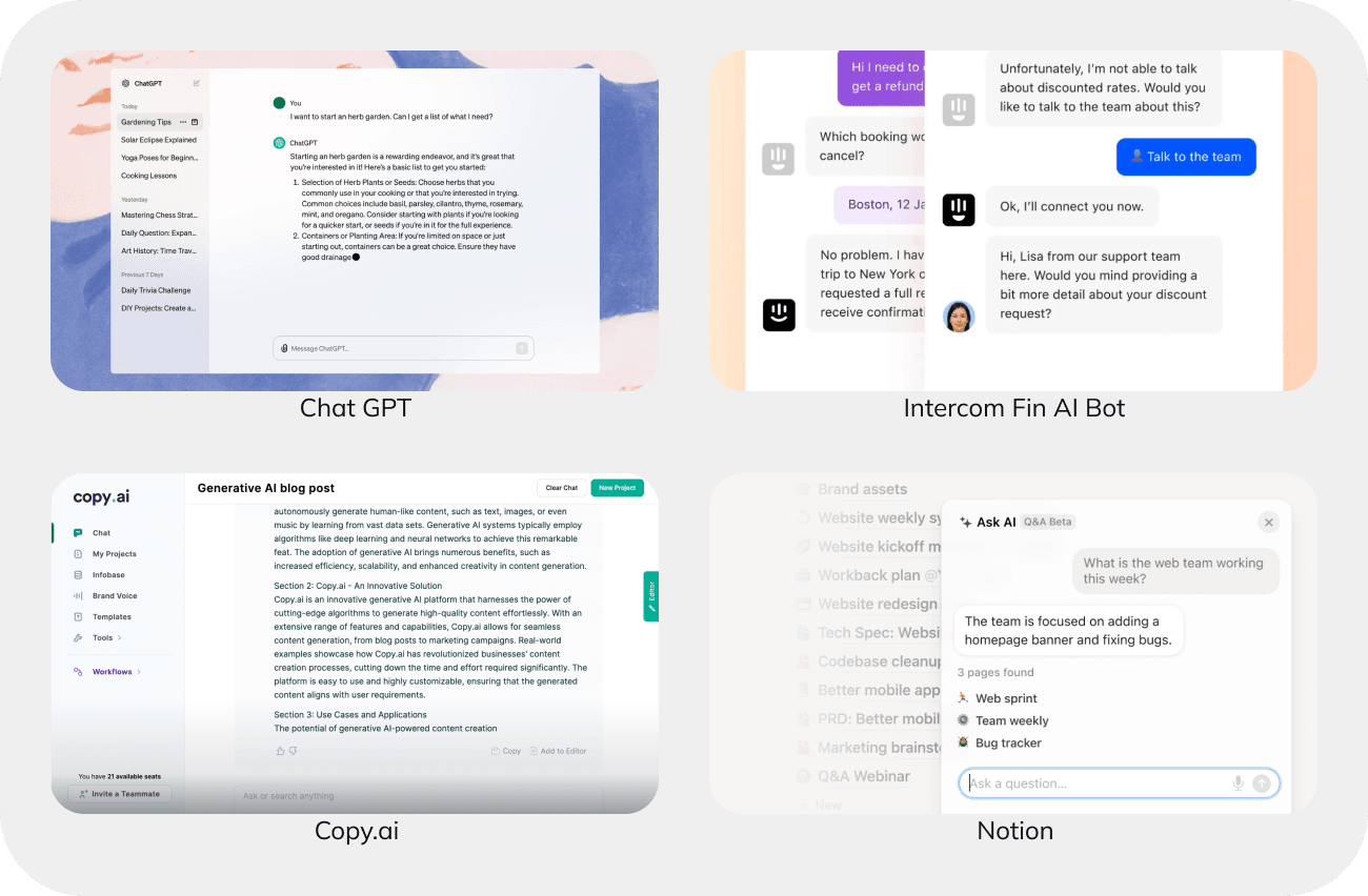
Text results
The simplest method for presenting large language model (LLM) results is through text in a chat interface.
This universal approach works well for most use cases, offering a great deal of flexibility. However, it can sometimes be inefficient. To enhance the appeal of text results, breaking them into smaller chunks and categorizing them makes the information more scannable and digestible.
In context-driven environments, like Notion, displaying results alongside the original text allows users to compare and decide whether to accept the changes, without altering the original content.
Couple of options to choose from
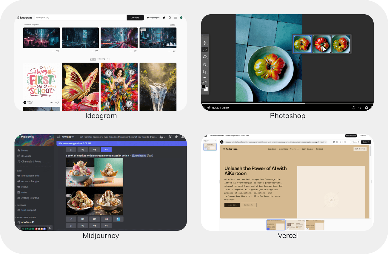
When precision is less critical, and creativity is the goal, AI often generates multiple results for users to choose from.
Applications like Midjourney and Photoshop typically offer 3-4 options.
This isn’t random—research suggests that more than four options can overwhelm users, making decision-making harder.
Open canvas
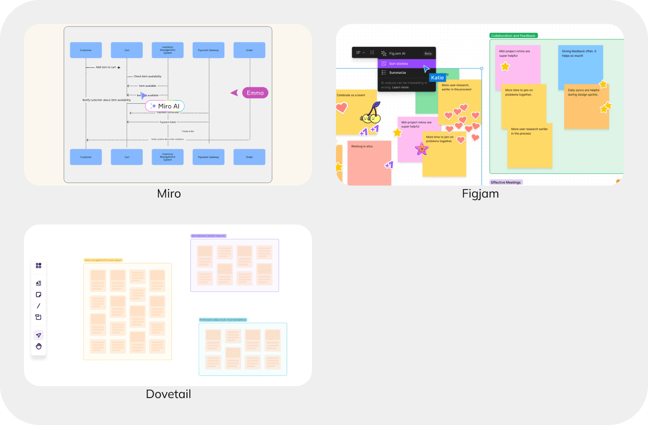
In tools like Miro, FigJam, and Dovetail, AI integration within a canvas environment showcases how adaptable AI can be.
Users can select multiple stickies and have them categorized or summarized by AI, reducing manual effort and streamlining the process.
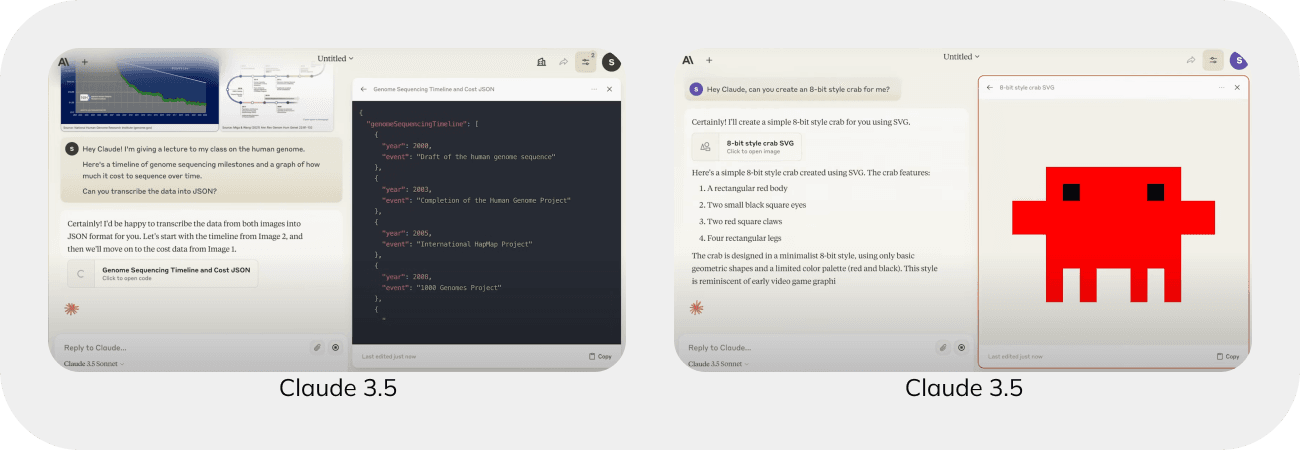
Two windows
For tasks like generating code or images, screen real estate can quickly become cluttered.
Claude has introduced a clever solution: an additional window that spans the entire height of the screen, displaying results alongside the chat. This separate scrollable space makes it easier to work with outputs and refer back to previous results.
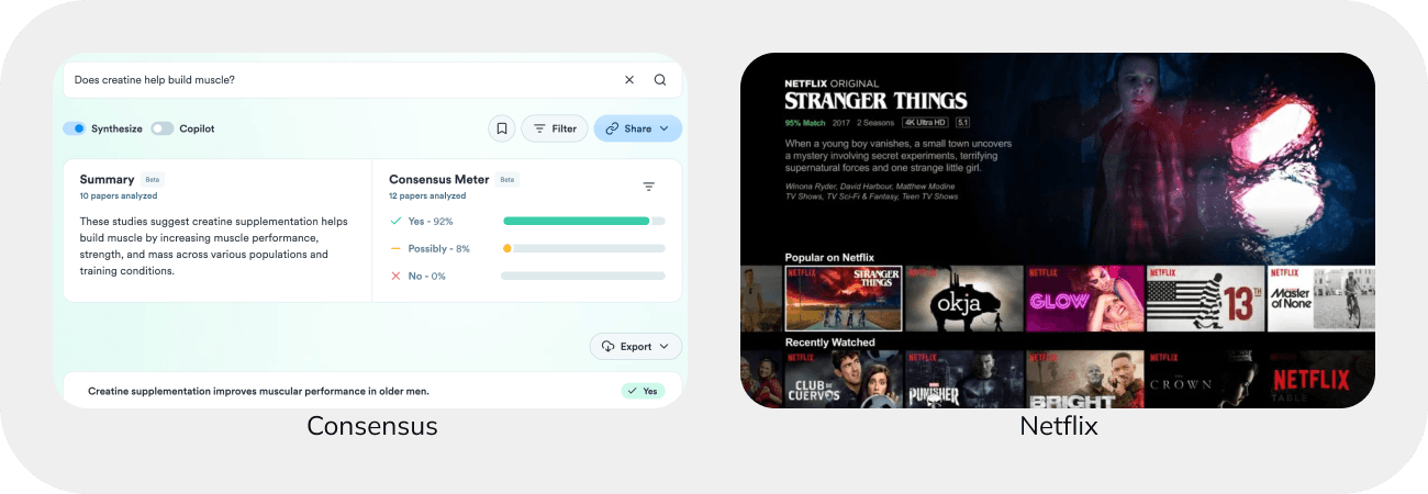
Confidence status
Showing the confidence level in AI predictions can reduce the unpredictability of outputs.
This feature can rank multiple results based on confidence. For instance, after describing what you’re looking for, the AI could present a range of images with confidence ratings. Similarly, recommendation features could use confidence levels to explain how closely a show or book matches your tastes.
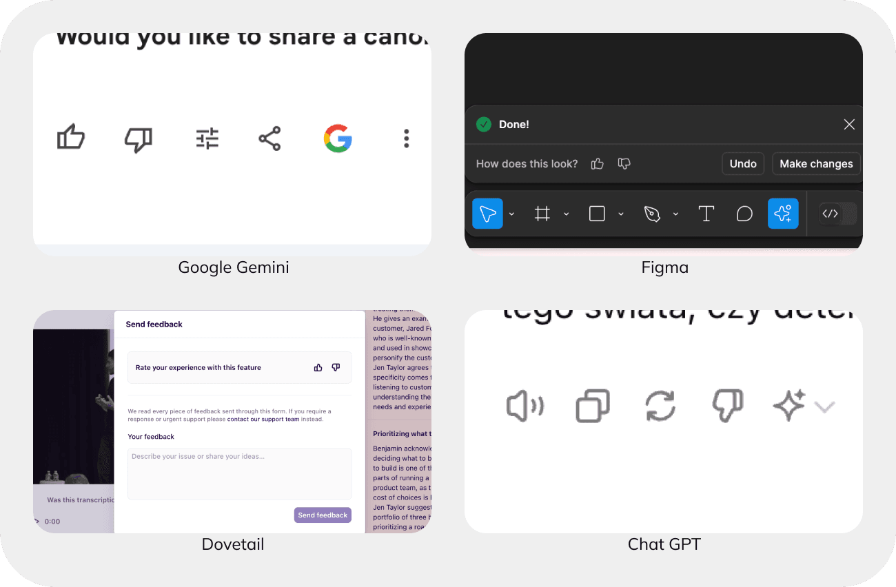
Getting feedback
Feedback is crucial for refining AI models and improving future recommendations.
The most common method is through thumbs up or down, indicating whether to show more or less of similar content. To collect even richer data, feedback questionnaires with pre- selected questions and answers, or open input options, can be employed. This ensures more detailed and actionable feedback.
Good AI interface design: Best practices
When you’re working with AI, there are a few important things to keep in mind, as mentioned in the People + AI Guidebook.
1 Determine if AI adds value
AI is a powerful tool, but it excels in specific tasks. Before jumping into AI development, assess whether your product or feature truly benefits from AI integration.
AI shines in areas like
- content recommendations,
- future predictions,
- language comprehension, and
- image recognition.
However, if your focus is on predictability, transparency, or human control, a simpler rule-based solution might be more effective.
2 Set the right expectations
Transparency is crucial for AI-powered products. Given that AI operates on probabilities, errors or unexpected results are always possible.
Building trust requires honesty about both the strengths and weaknesses of your system. While acknowledging potential mistakes might initially lower trust in a single prediction, it fosters long-term reliability as users understand the limitations and avoid over-reliance on the AI.
3 Explain the benefit, not the technology
When presenting your AI-enhanced product, emphasize the benefits it brings to the user experience rather than the technical details.
Even if your AI is groundbreaking, users are more interested in how it improves their experience. Conduct user studies to determine the right level of technical explanation—what do users actually need to know to use your product effectively?
4 Be accountable for errors
AI isn’t perfect, and planning for errors from the start is essential. This involves anticipating potential mistakes and their impacts, and being upfront with users about these possibilities.
Consider the stakes for your users and the consequences of both false positives and false negatives. To manage errors, provide explanations, offer manual controls when AI fails, and ensure robust customer support.
5 Invest early in good practices
Successful AI products are built on high-quality data. Poor data planning and collection can lead to “data cascades”—issues that only become apparent later in development, negatively affecting user experience.
To avoid these pitfalls, collect data in batches, accept some “noisy” data (data with imperfections), plan for ongoing data maintenance, and collaborate with domain experts to ensure your data accurately reflects the real world.
Conclusions
Designing AI-powered products comes with unique, not-yet-explored challenges. Yet, since the number of AI projects is only set to grow, it’s key they are designed the right way.
If you want to build an AI product that stands out, reach out to us. With our expertise and know-how, we can help you design top-notch AI apps.


