How to design a mobile banking app for Gen Z
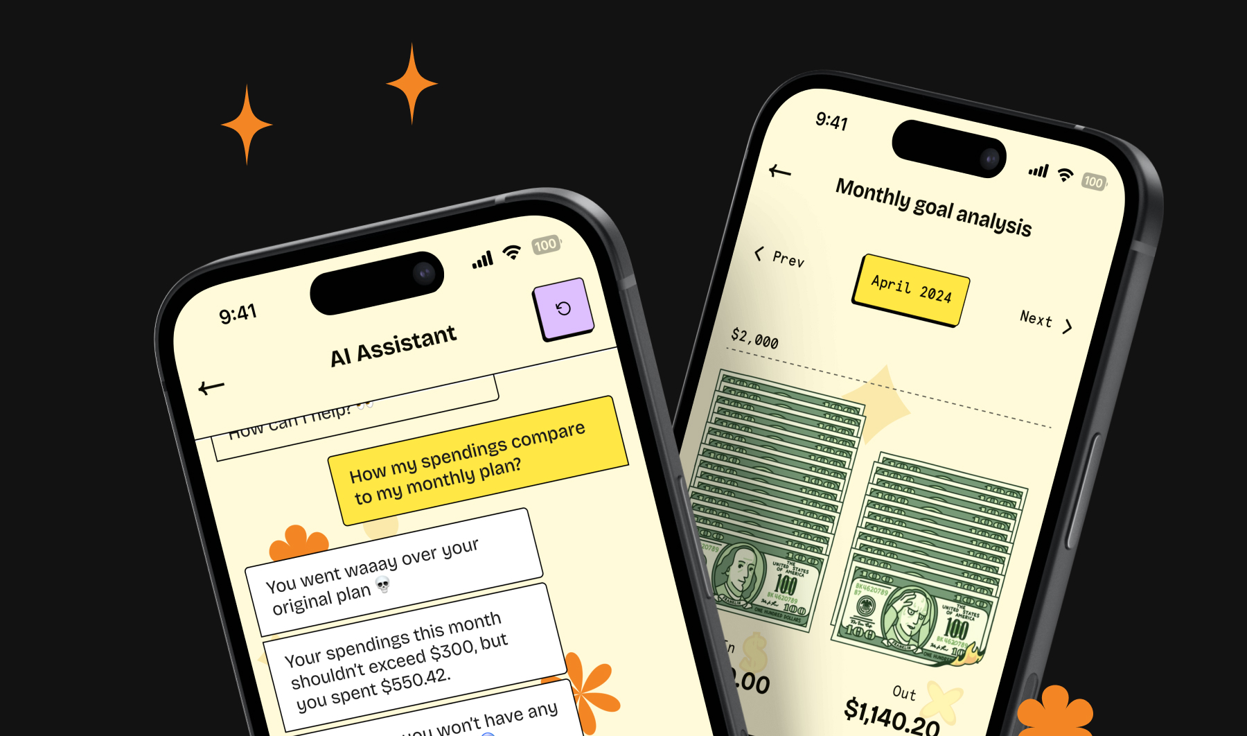
In this article, I’ll explore best practices and cutting-edge insights for crafting a mobile banking app tailored specifically for this digital-savvy generation. To show how to meet Gen Z’s needs, I’ll discuss Spark, a concept banking app I designed.
Gen Z demands more than just effective interface—they expect an experience that is seamless, exciting, and enjoyable (48% of Gen Z respondents said they would switch banks in favor of a better customer experience). For them, functionality is merely the starting point. They crave authenticity, creativity, and innovation in every interaction. This means designers face the challenge of balancing these elements to create a banking app that not only functions flawlessly, but also captivates and delights its users.
Join me as I uncover how to strike this delicate balance and create a banking app that resonates with the vibrant spirit of Gen Z.
See the Spark app design project on Behance ✨
Our AI-based Market Research Tool further supports this endeavor by providing invaluable insights into user preferences and market trends. This tool leverages advanced AI to conduct swift, comprehensive market research, helping you understand Gen Z’s expectations and behaviors.
Let’s start with the basics: UX design principles
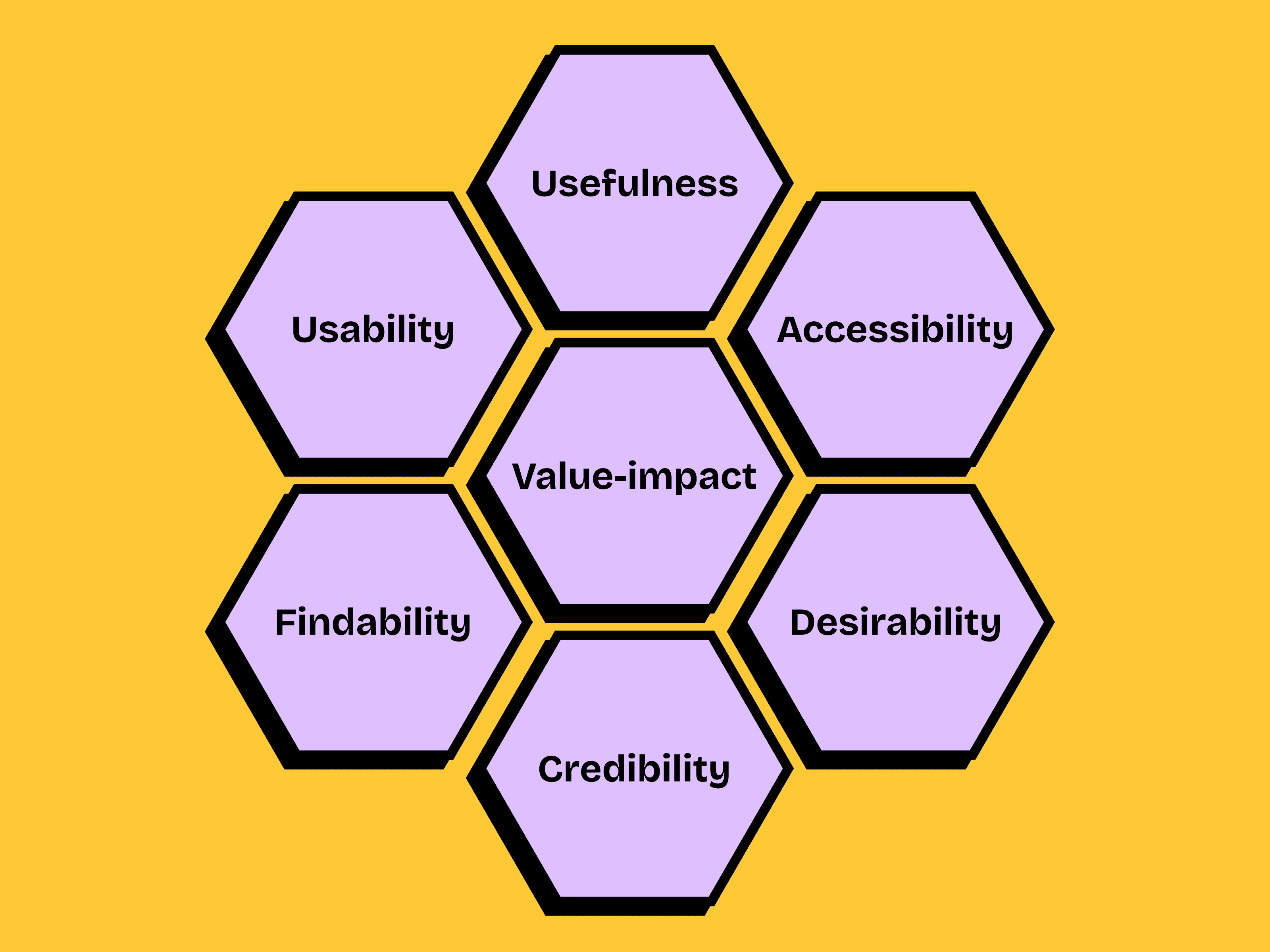
To create a banking app that captivates and retains Gen Z users, designers must master the seven principles proposed by Peter Morville, a pioneer in information architecture. They’ve been around since 2004, but they are still highly relevant for modern product developments projects.
These principles outline essential aspects that contribute to an exceptional user experience, making a product not only functional but also appealing. Let’s delve into each principle:
- Usefulness: A product must effectively meet user needs and solve their problems. If users can’t immediately grasp the purpose of your app, it indicates poor UX. For complex products, employing progressive disclosure—introducing advanced features gradually—can help users acclimate and appreciate the full range of functionalities.
- Usability: An app must be easy to use and navigate. For instance, if your app aims to help manage payments, but the interface is convoluted and confusing, it defeats its own purpose. Even seemingly minor issues, like the absence of a back button or a confusing sign-up process, can significantly harm usability.
- Desirability: This quality makes a product fun, engaging, and appealing. A desirable app pleases users through interaction, sparks positive emotions, and encourages repeated use.
- Findability: This principle emphasizes intuitive navigation, well-structured information, and an effective search system. Achieve this by keeping the interface clear and free of clutter, maintaining consistency across screens, creating a clear hierarchy of items, and conducting thorough user research.
- Accessibility: Ensuring that everyone, regardless of their disabilities, can enjoy a good user experience is crucial. Contrary to popular belief, designing for people with disabilities doesn’t make designs boring or uninteresting. In fact, it makes design more usable and enjoyable for all users.
- Credibility: Credibility is what makes your audience trust and believe in what you offer. Building trust through reliable performance, transparent communication, and user testimonials is key to retaining users and encouraging loyalty.
- Value-impact: A well-designed product delivers value to both users and the business, but the primary focus should be on addressing user needs, as this ensures the product serves its intended purpose. Neglecting user needs in favor of company profit can lead to creating beautiful, but ultimately useless products.
Gen Z Characteristics

Generation Z, often called Zoomers, grew up immersed in the digital world, where smartphones and social media are their second nature. They seamlessly navigate technology for communication, learning, and entertainment, spending an average of 11 hours per week staring at their phones. Their upbringing in this digital era has shaped them into a diverse and inclusive generation, accepting of all kinds of people.
Zoomers are notably ambitious, and they’re more likely than previous generations to start their own businesses, with half of them wanting to be founders. They are driven by a desire to make a positive impact on the world. Issues such as social justice, environmental sustainability, and equality matter a lot to them, and they actively work towards creating a meaningful change.
Mental health is another area where Gen Z is breaking new ground. They are refreshingly open about mental health challenges, with 27% of them seeking for help when needed, compared to 15% of millennials and 13% of Gen Xers.
Financially, Gen Z is surprisingly savvy. They prioritize saving from a young age and are eager to learn about personal finance to secure their futures. When it comes to brands and leaders, they are preferring ones who are authentic, genuine and true to their values.
Understanding these characteristics is essential for designing products, particularly banking apps, that resonate with Gen Z. By aligning with their values and leveraging their tech fluency, we can create engaging, meaningful, and impactful user experiences that meet their unique needs and aspirations.
Visual language of the Spark app
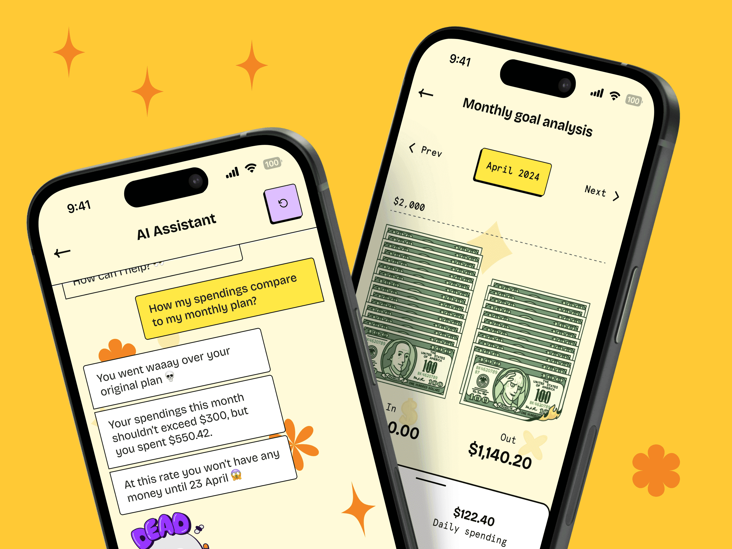
From the moment you open the Spark app, it’s clear that it aims to stand out. With bold titles, vibrant colors, and quirky graphics, Spark knows exactly what it wants to be and embraces its unique identity wholeheartedly. It doesn’t try to appeal to everyone, accepting that some might not appreciate its daring design. But for those who do, there’s no going back to the bland, neutral banking apps of the past.
The visual style of Spark can be described as neubrutalism, or neobrutalism. This design trend draws inspiration from the Brutalism architectural movement of the 1950s, which emerged as a rebellion against the status quo. Brutalist buildings were brutally simple, often constructed from raw concrete with no decorative elements. Similarly, neubrutalism in graphic design rejects conventional aesthetics, merging traditional layout concepts with high-contrast, solid, and often purposefully clashing colors, along with a bold typography.
Gen Z’s tendency to question norms is similar to the neubrutalism ethos making this style particularly appealing to them. The contrast between modern design and the pre-2000s aesthetic resonates with Gen Z, who find the unique, rebellious nature of neubrutalism a perfect fit for their tastes.
Sparks leans into neubrutalism by following characteristic set of rules:
- Bold Typography: Spark employs an unconventional mix of fonts. For titles and some descriptions, it uses Bricolage Grotesque, a neo-grotesque font family by Mathieu Triay, known for its clean and modern design. This is complemented by Apercu Mono Pro, a monospace typeface full of unique, quirky characteristics. This combination gives the interface a distinct and playful personality.
- Clashing colors with high contrast: App uses a strong contrast between colors, typography, and background elements to create a powerful visual impact.
- Dark, heavy black outlines and borders: The app features cards and buttons outlined with thick black borders, resigning from gradients for a more striking appearance.
- Unusual Shapes: Abstract geometric shapes serve as decorative elements throughout the app’s screens.
- Illustrations: Spark incorporates sticker-like illustrations designed to capture attention and enhance navigation within the interface.
Navigating the bold visual landscape of neubrutalism comes with its challenges. The high contrast and striking colors can sometimes overwhelm the eyes, making it crucial for designers to balance bold visuals with usability. Ensuring that the interface remains legible and that background elements do not compete with call-to-action buttons and other critical parts of the interface is essential.
By embracing neubrutalism, Spark creates a banking experience that is not just functional but visually captivating and refreshingly different—perfectly aligned with the values and preferences of Gen Z.
Onboarding in banking applications
When it comes to app onboarding, there are several approaches—interactive tours, contextual tips, and checklists.
However, the most common, and often overused, method is the walkthrough-style tutorial. We’ve all encountered these: you open an app and are immediately bombarded with explanations of its functionalities. These tutorials can be intrusive, slow you down, and ultimately fail to help, as users tend to forget everything by the time they start using the app.
Research shows that these tutorials don’t make users faster or more successful in completing tasks; instead, they often make the experience feel more difficult.
This is why onboarding tutorials should not be treated as a necessity. It’s crucial to thoughtfully consider and test whether they are truly needed. There are specific scenarios where onboarding screens are beneficial, such as:
- Complex apps: Discovering such apps by users might be overwhelming for them.
- Required information to start: For apps that require users to create an account or confirm their identity, like banking apps.
- Personalized functionality: For apps that need to tailor their functionality to each user’s context and preferences, such as fitness apps, that need to know the user’s height, weight, and blood pressure.
- Unique features or workflows: For apps that include features or workflows that are unique, unfamiliar, or different from standard UI patterns, such as a bike-renting app, that need to explain how to use their service.
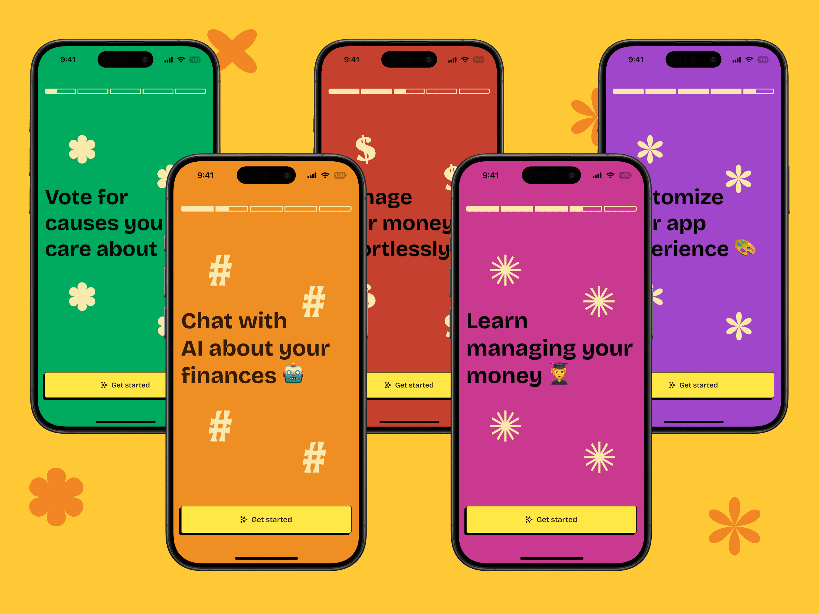
In Spark Bank, the onboarding process requires users to create an account and confirm their credentials. If this were the first step after opening the app, it could create significant friction and lead to user drop-off. To smooth this experience, Spark introduces an additional step designed to excite users and increase conversion, rather than just instruct them on app usage. This is achieved through a couple of simple screens with bold titles, vibrant colors, and a familiar pattern from Instagram stories. These screens remind users of Spark’s unique style and highlight features like voting for social causes, chatting with AI, and personalization options. This approach not only reinforces the app’s distinctive identity but also engages users from the outset, making the onboarding process both effective and enjoyable.
Customization and personalization
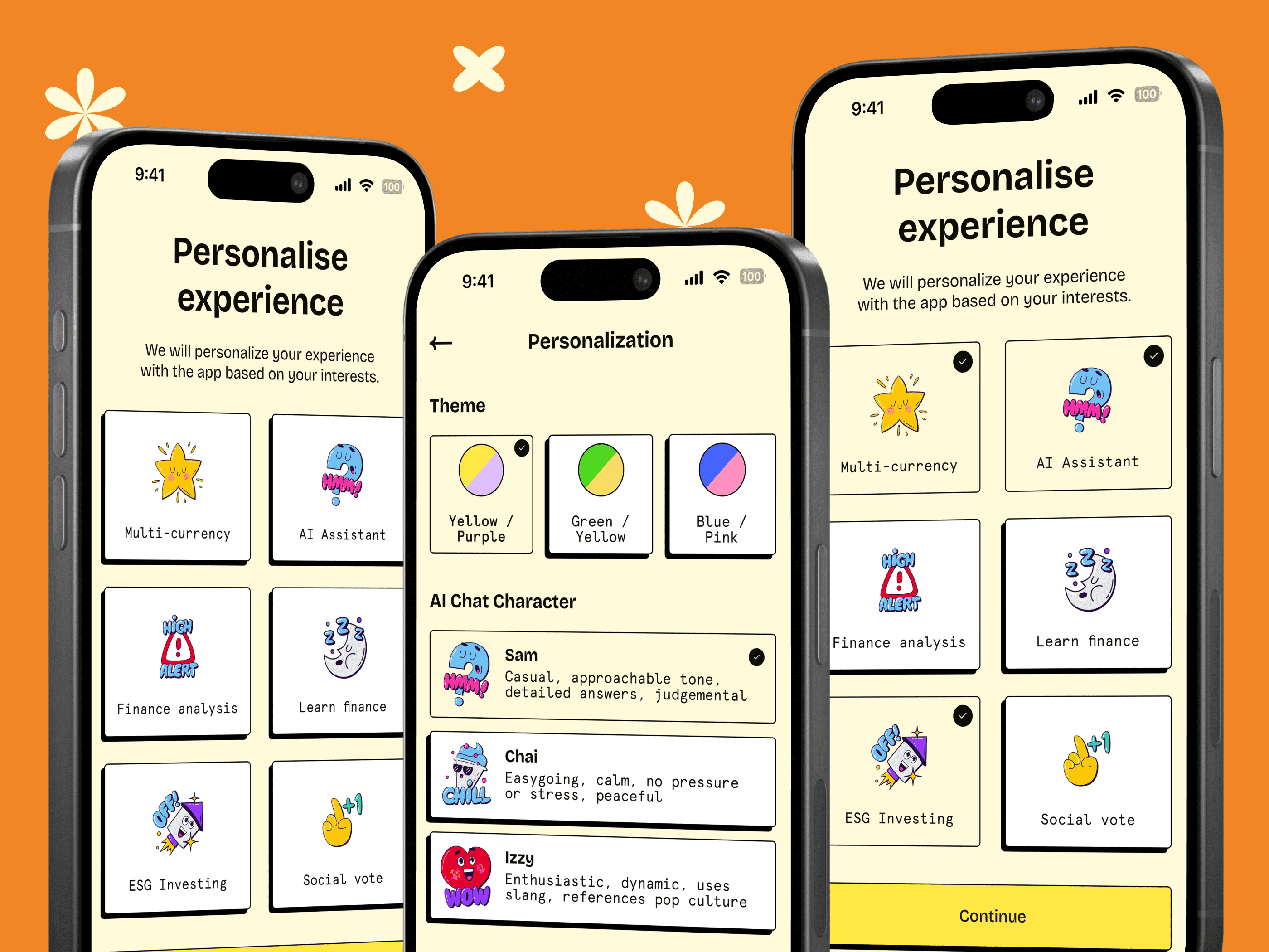
Generation Z enjoy customized and personalized functionality, which allows them to express their individuality, feel unique, and connect with their community.
In the context of app design, customization refers to manual changes users can make to the interface, such as altering themes, avatars, fonts, and background modes. Personalization, on the other hand, involves automatic adjustments based on user behavior, such as product recommendations in e-commerce, personalized social media feeds, or promotions for nearby restaurants.
When designing personalized features, it’s crucial to strike a balance. Offering too many options can overwhelm users and lead to dissatisfaction with their choices. For personalized feeds, it’s essential to include options like “show less” to help users manage content, especially if the algorithm promotes potentially harmful material.
Spark seamlessly integrates both customization and personalization to create a tailored user experience. Users can select their interests, change the app’s theme, choose an AI chat character, and set menu shortcuts. Spark ensures the range of customization options is sufficient to make the experience unique without being overwhelming. Spark also offers several personalized features. The AI assistant adapts to users based on their chat history, enhancing the conversational experience. The social voting feature for local initiatives is tailored to the user’s location, fostering a sense of community involvement. Moreover, the learning module recommends the next course based on previous interactions, ensuring that educational content is relevant and engaging.
Attract Gen Z with Gamification
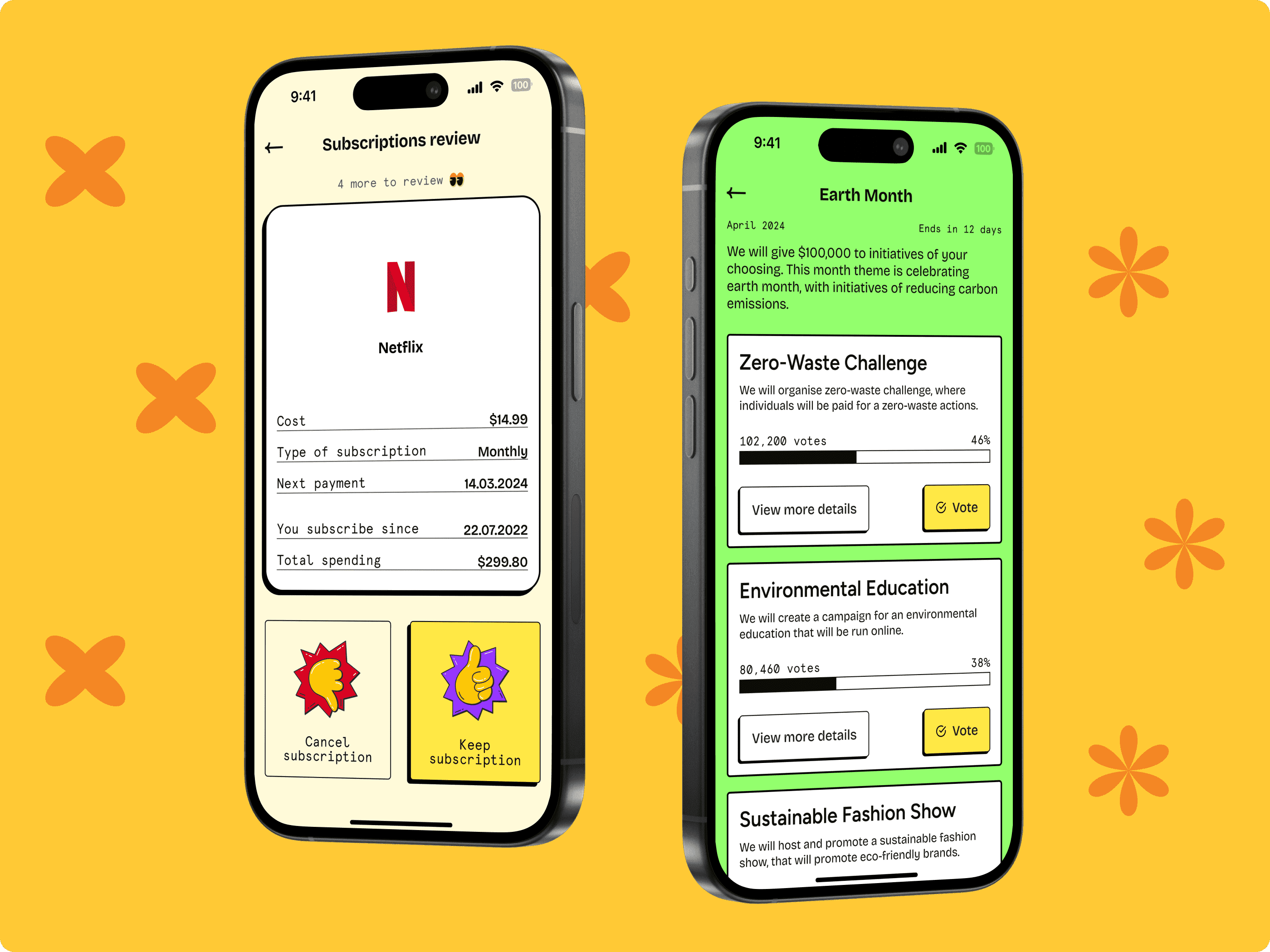
Games have an uncanny ability to inject fun into mundane tasks, whether it’s washing dishes or learning a new language. Observing the success of the mobile gaming market, teams worldwide have incorporated the best game aspects into non-game environments – a phenomenon known as gamification.
Gamification can be a powerful tool for driving user engagement in banking apps, but it’s crucial to remember that it’s not a cure-all solution. It works best when applied to experiences that are already helpful and intuitive, serving as a delightful addition rather than a fix for underlying issues like poor usability or product-market fit.
Incorporating gamification into your product involves deploying various mechanics, such as offering meaningful choices, enabling progression, facilitating social interactions, fostering habits, and urgent optimism. While designing these mechanics, it’s essential to remember about primary business goals of gamification, and avoid common pitfalls. Don’t deceive users into actions they don’t want to take, steer clear of dark patterns like Pay-to-Skip, and refrain from making too many game elements, which may detract from the primary user tasks.
Spark apps implement gamification mechanics in a subtle way.
- Social voting and customization allows users’ to meet their need for autonomy, a psychological freedom and desire to take actions. Social voting creates more engagement by contributing to global and local initiatives, giving a sense of purpose and motivation among users.
- Spark adds epic meaning to user actions, by allowing them to vote for global and local initiatives, that serves a bigger purpose of having a meaningful impact on the world’s biggest challenges. In general, the point is to add a meaning behind other gamification elements, like points and badges. For example, the “Zombie, Run!” app motivates users with a fictional storyline of being chased by zombies, to encourage them to run daily.
- Saving goals and daily reminders in a learning module are the challenges and quests that turn uninspiring tasks into adventures. Completing challenges and quests is fueling users a sense of accomplishment and triumph. Challenges are the perfect tool in your product to motivate users, but remember to suit a challenge level to user skills and possibilities, and give small rewards during a challenge to keep user spirits up.
- Managing subscriptions becomes an engaging experience in Spark due to a swiping game that gives users a mental state of blissful productivity. When designing for blissful productivity, remember that the task should have the right difficulty. When the task is too difficult, it causes people to be anxious, and when the task is too easy, it causes boredom. The task should have a gradually increased difficulty, if it will be performed repeatedly.
Beyond these features, there’s a wealth of gamified mechanics that can enhance your product. The need for competence can be fulfilled by incorporating elements such as points, badges, and leaderboards, which make users feel successful and competent. By leveraging the loss aversion bias, you could offer features like free trial, creating a sense of ownership that makes the prospect of losing it intimidating at the trial’s end. Adding constraints to your product can make it more fun by creating psychological tension, motivating users to react faster or be more proactive (be careful — it’s crucial to allow users to adjust or disable these constraints to avoid causing stress, especially for those with anxiety). Lastly, recognizing people’s desire for connection and community, consider incorporating elements like communities and teammates to foster close relationships and a sense of belonging among users.
In essence, gamification in Spark enriches the user experience, making tasks enjoyable, meaningful, and rewarding, while also fostering a sense of community and connection—a testament to the power of playful design in engaging Gen Z users.
Tailoring the Spark app to Gen Z’s Unique Needs
When designing an app for a specific demographic, understanding their distinct needs, goals, and preferences is essential. The Spark app addresses these needs by incorporating specific banking-related features tailored to resonate with Gen Z and following some of the latest trends in mobile banking.
AI companion
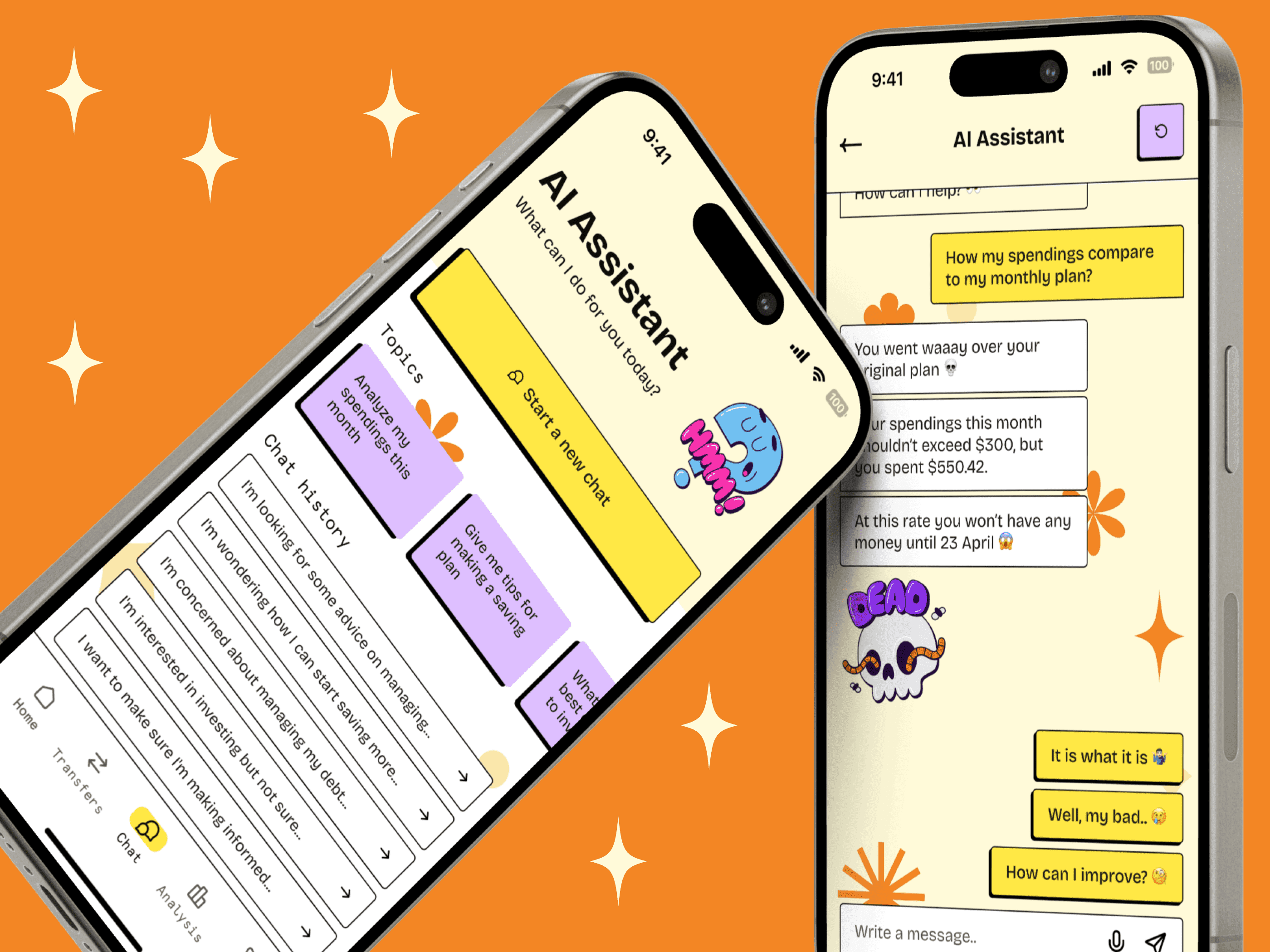
A recent survey revealed that over half of Gen Z experiences anxiety when confronted with their personal data, particularly financial information. Gen Z is 36% more likely than baby boomers to struggle with understanding their personal data, and 55% of them are turning to AI for assistance. In this case, conversational banking (using AI chat to help customers answer their questions and solve their problems) might be the game-changing functionality.
Companies like Cleo have already embraced AI chat to aid users in understanding their finances and seeking advice. Recognizing this trend, Spark integrates a private AI chat companion customized for Gen Z. Through fun and playful messages adorned with emojis and stickers, the aim is to alleviate users’ anxiety surrounding financial discussions, fostering a natural and comfortable conversation environment.
At the same time, it’s important to notice that designing AI interfaces (such as chatbots) comes with its unique challenges:
- Usability issues: Many AI interfaces rely on prompt-based inputs, which can be difficult for users, particularly those with low literacy levels;
- It’s hard to write good prompts: Writing the right questions or commands for the chatbot can be tricky. This makes it hard to get the right answers, and can result in users feeling frustrated and disappointed with the chatbot;
- Designing intuitive hybrid interfaces: With the field of AI design being so new and not-yet-explored, creating hybrid interfaces that combine AI’s power with user-friendly graphical elements is challenging.
It’s challenging, but not impossible. Check this article on designing AI interfaces to learn how to do it right.
And if you’d like to create any type of AI-based product, this guide on building AI software will be a great start.
Ethical investing
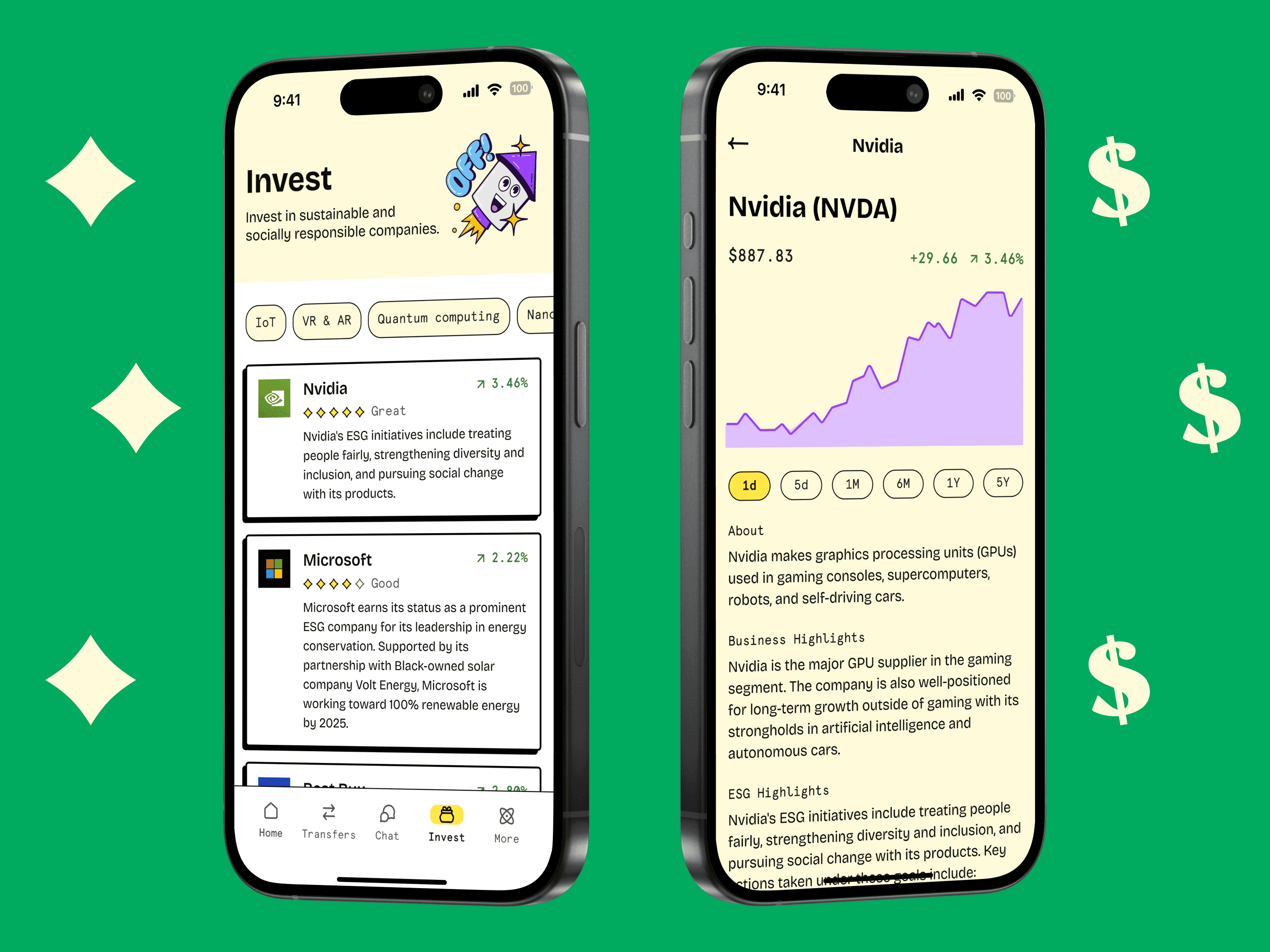
Spark’s investment functionality deviates from the norm by prioritizing companies that adhere to positive environmental, social, and governance (ESG) principles over pure profit.
With a staggering 90% of Gen Z investors considering ESG factors and 85% willing to sacrifice returns for values-aligned investments, Spark provides valuable insights into ESG rankings and overviews of different companies. This emphasis on ethical investing could position Spark as the go-to platform for socially responsible investment decisions and aligns with the broader trend of sustainable banking (a subset of the green fintech market).
Financial education
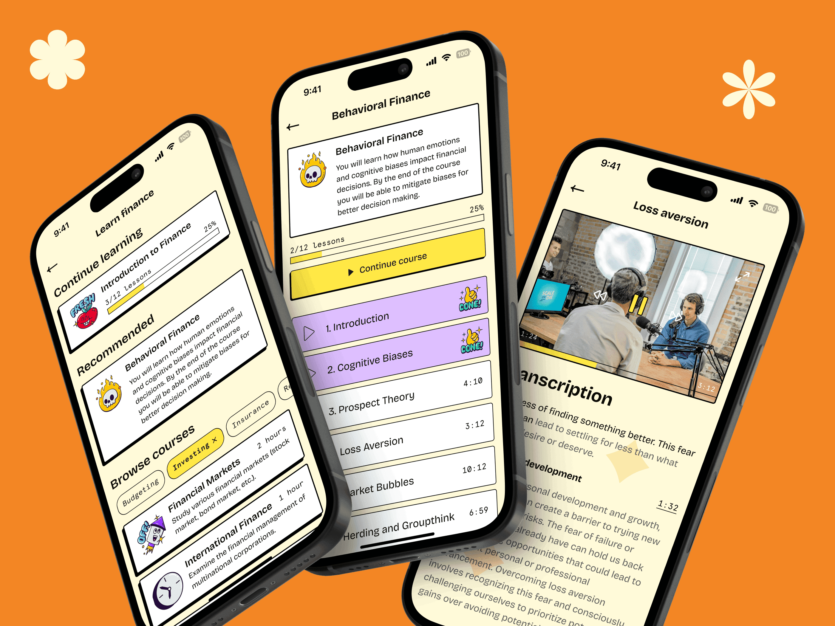
Gen Z’s concern for financial security and eagerness to learn about banking and finance from a young age is evident. Despite being the most investing-savvy generation yet, a significant barrier remains: 56% feel they lack sufficient knowledge about investing. To address that, Spark’s learning module offers free courses, leveraging gamification to provide engaging learning experiences. Unlockable achievements and progress bars provide users with feedback, incentivizing their journey towards financial literacy.
By aligning with Gen Z’s values and aspirations, Spark not only caters to their immediate needs but also cultivates a sense of empowerment and social consciousness. These features not only enrich the user experience but also position Spark as a trusted ally in navigating the complexities of personal finance for the next generation.
Social vote
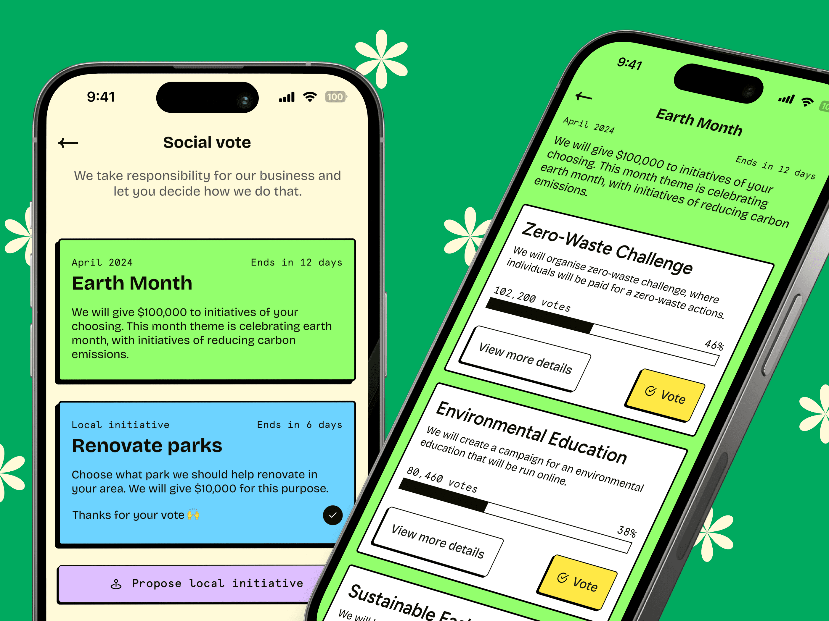
The growing belief among Gen Z that companies should contribute positively to the environment and society drives Spark’s commitment to environmental initiatives. Recognizing that 64% of Gen Z would switch banks if their current provider fell short on ethics and sustainability, Spark allocates a portion of its budget to environmental causes, allowing users to vote on which initiatives to support. This engagement empowers users to make a tangible impact and reinforces their sense of social responsibility.
Summary. Designing a mobile banking app for Generation Z
Designing a mobile banking app for Gen Z requires more than just functionality; it demands an engaging, authentic, and seamless user experience that resonates with their tech-savvy and socially conscious nature. This article delves into best practices for creating such an app, emphasizing the importance of mastering UX design principles like usability, desirability, and accessibility. Understand Gen Z’s characteristics—such as their entrepreneurial spirit, emphasis on mental health, and preference for ethical brands—and you can tailor features to meet their unique needs.
The Spark app serves as a prime example, showcasing a bold visual style inspired by neubrutalism, engaging onboarding processes, and gamification to make financial management fun and rewarding. Features like AI companions for financial advice, options for ethical investing, and financial education modules cater specifically to Gen Z’s preferences. By aligning with their values and leveraging their digital fluency, Spark creates a meaningful and impactful user experience that stands out in the competitive banking app landscape.
Now that you know how to design a mobile banking app for Gen Z, check out our guide on choosing the right contract model (Time & Materials vs. Fixed Price) for building it.
For more Gen Z-related content, check also:
- Gen Z & the future of banking. 6 key trends to understand Zoomers
- Gen Z healthcare: App preferences, trends, and features that resonate
- How to market to Gen Z
We recently added some Gen Beta-related content, too:


