How to make a pitch deck that works
Hi, today we’ll talk pragmatically about how to create a pitch that converts almost 100%. I’ll show you the pitch I built — the one that opened doors to most investors and most VC funds. Then we’ll break that pitch down piece by piece, discussing every slide: why it looks the way it does, why it contains what it contains. And at the end, I’ll share the mistakes I made, and we’ll analyze the same pitch from the perspective of what could still be improved. So, let’s go.
Who is this guide for?
What we’re doing here isn’t aimed at people just starting out. The knowledge I’ll share today is for those who’ve already taken their first steps – who’ve already tried raising funds, maybe even created more than one pitch deck – but still struggle with the fact that their decks don’t open doors, that investors aren’t scheduling meetings or continuing the process.
The knowledge I’m sharing comes from my second fundraising process for my startup, Health Holder – Teczka Pacjenta.
What is a pitch deck, really?
Let’s start with this: a pitch deck is the core tool of every startup founder. A pitch deck lets you open doors to VC funds, to investors. It lets you convert those investors into meetings – meetings where you can present your idea, your startup in more depth, and encourage them to invest.
I talked about how to do that in the previous article – about how to reach out to investors, how to raise funds – so I strongly encourage you to check it out too.
Why are most guides about pitch decks… wrong?
So let’s answer the question I asked at the beginning: why are most guides about pitch decks… wrong? Why do they often mislead founders, wasting their time and making them build decks that don’t convert – meaning they don’t lead to investor meetings? Why are conversion rates so low?
Most of the guides about building pitch decks – and I’ve gone through dozens, maybe hundreds – make the same mistake. They’re almost all based on pitch decks from startups that became huge successes – like Uber or Airbnb. And sure, these are great examples: those decks are nice, concise, and clearly describe the products.
But the fact that those startups had those decks doesn’t mean the decks were the reason for their success.
Both Uber and Airbnb had brilliant business models from day one. They showed traction right from the start – and that’s what convinced investors. The pitch deck was just an add-on.
What’s more, the founders and teams behind those startups already had strong experience, which opened many doors before they even started building their ideas.
So what I’m sharing today comes from my own experience and from conversations with many other founders who showed me how to build pitch decks that open doors almost 100% of the time.
How to build a working pitch deck?
Below, you’ll read:
- My pitch for this slide deck
- Explanation of why a slide is built this exact way
- What I would improve now
So, let’s go through my pitch deck for Health Holder – Teczka Pacjenta.
1. Hook
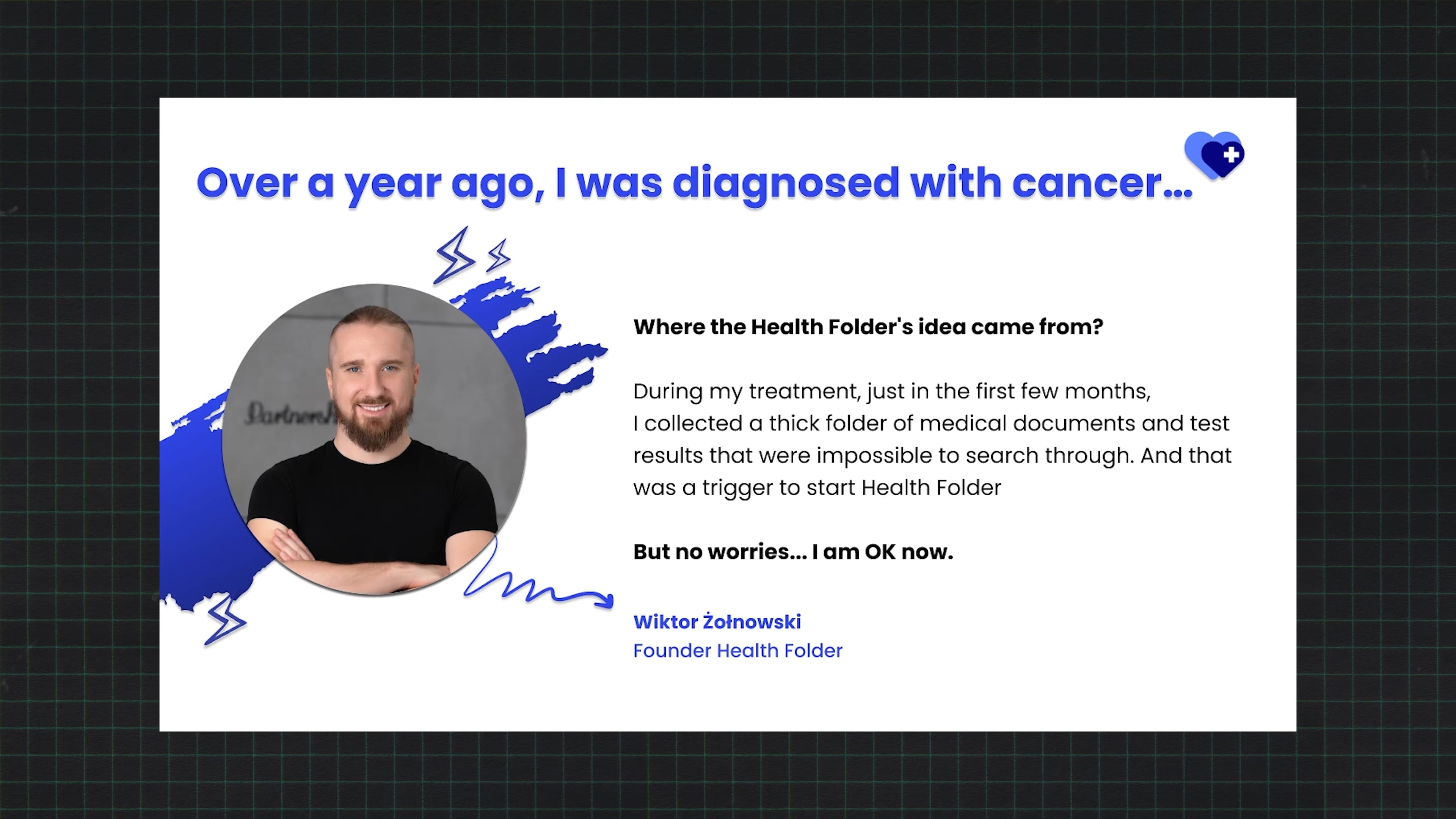
A little over two years ago, I was diagnosed with malignant cancer – and that’s when the story of Health Holder really began.
During my treatment, I realized there’s a huge problem with how medical documentation is managed. It’s scattered across different facilities. Patients are left on their own and usually go to doctors carrying a paper folder with their medical records.
To me, it was obvious this wasn’t an efficient way to organize, present, or share medical documentation – and it could definitely be done better.
One of the most common mistakes I see as an investor and startup advisor is that the first slide… does nothing. It wastes five seconds before I move on. The first slide should hook attention. In my deck, the top left has a provocative headline – something that grabs attention. Below it, there’s a large number in euros showing the size of the market we’re targeting. On the right, proof of traction – users. That makes investors think, “Okay, interesting. Let’s see if they’re paying customers.” Bottom left: we’ve invested 1M PLN ourselves – showing commitment. Bottom right: a breakdown of the digital healthcare market we’re addressing.
I said earlier that a pitch should tell a story – and every story needs characters. If you don’t have a personal story connected to your product, find someone who does. Almost every startup idea starts with a story – a problem you saw or experienced. Put that story up front. Make sure the audience can relate to your hero.
2. The team
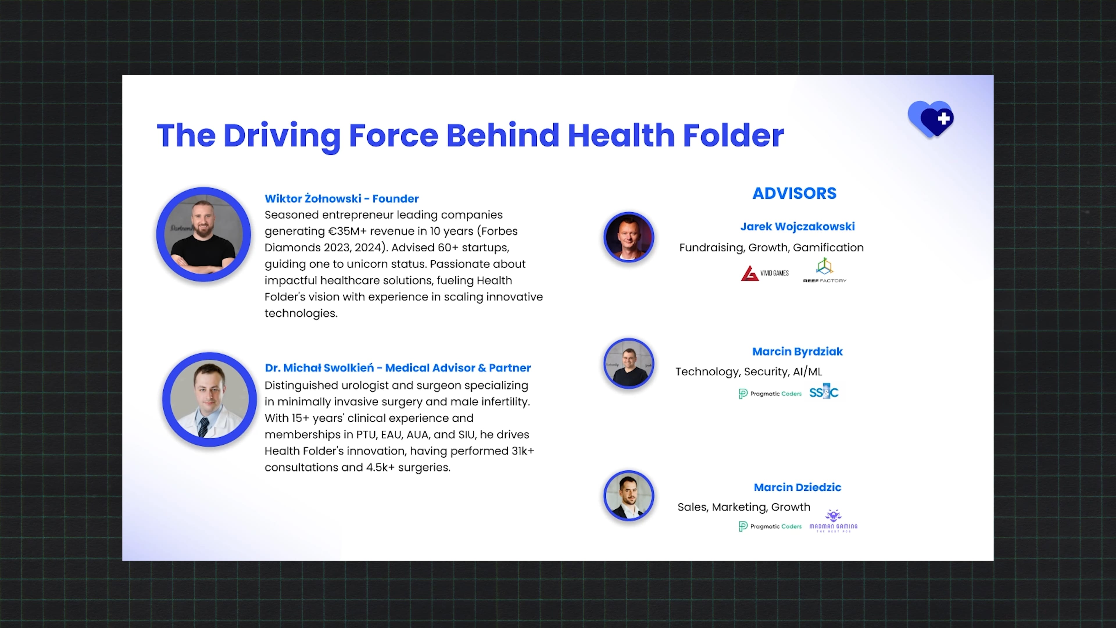
Along this journey, I met many great doctors, including Dr. Michał Swolkień – the surgeon who operated on me and, frankly, saved my life. After hearing my idea for the Patient’s Folder, Michał decided to join our team.
In my deck, this came early – right after the story – which is unusual, but it worked because the team was part of the narrative. On the right side, I also showed our advisors. So again – story continuity.
3. So, what is Health Holder?
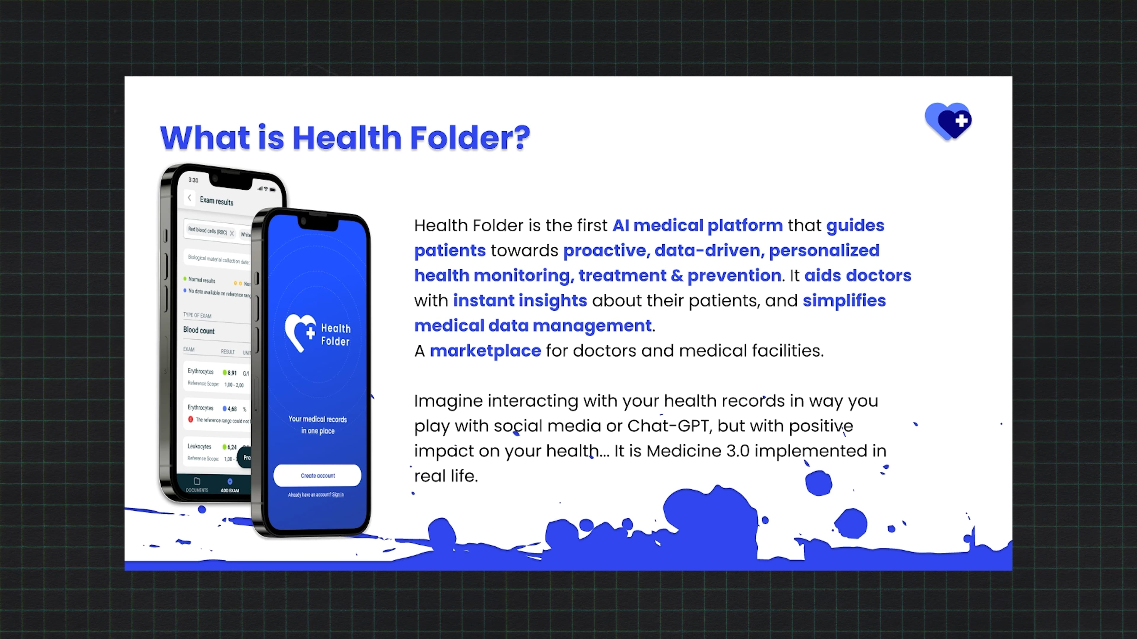
Health Holder is an AI-based platform that guides patients through their healing process or helps them manage their chronic conditions.
We explained what Health Holder is – bold headlines that answer clearly.
Then – why we’re doing this.
4. Challenges & our solution
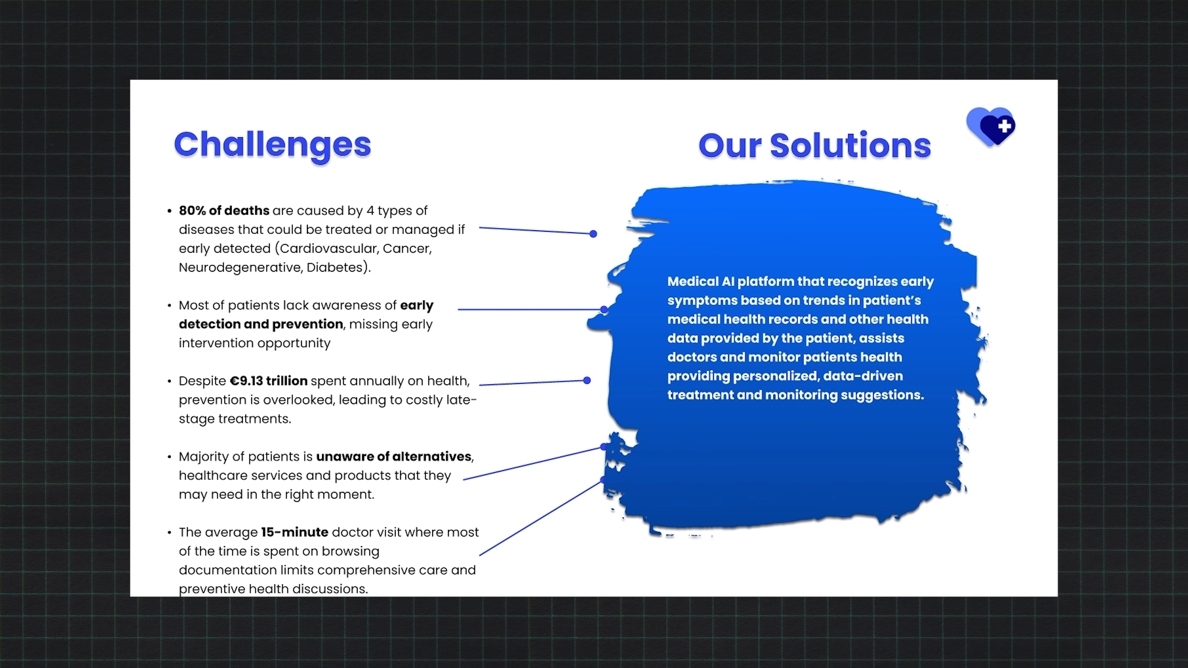
The main challenge is that 80% of deaths worldwide are caused by diseases that could have been prevented – or cured – if diagnosed early. That’s one of the key problems we address with Health Holder.
I wanted to start with a hard-hitting stat: 80% of deaths caused by diseases that could be detected early. Our solution addresses that problem.
5. Why Health Folder
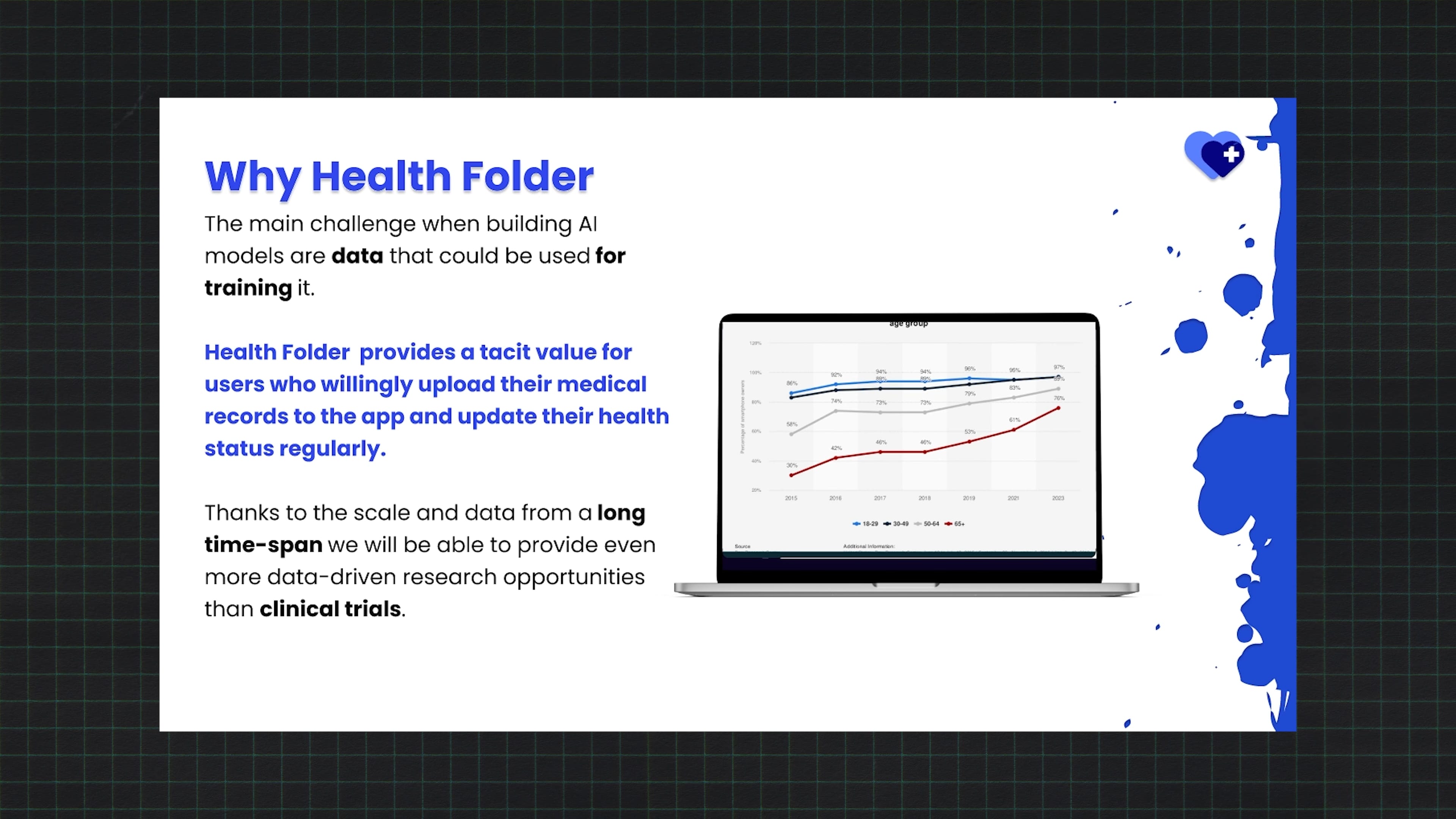
Early diagnosis and health monitoring depend on collecting data about patients’ conditions. Our app lets patients easily add their own medical records and health information – in a simple, user-friendly way. As a result, we collect large amounts of valuable health data.
6. Why now?
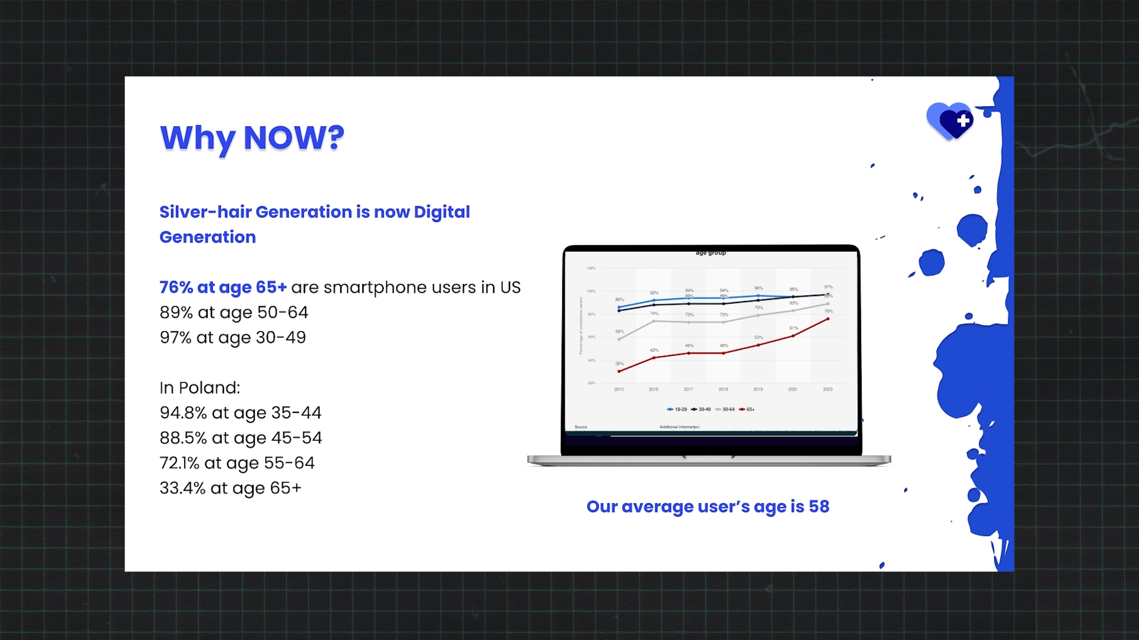
Because we’re entering an era where the Silver Generation – people over 65 – naturally use technology and smartphones. In the U.S., 76% of people over 65 use smartphones. In Poland, it’s a bit less, but still significant. This means our target audience is already tech-ready.
Then a slide about why our solution works now, positioning us against alternatives. This one I added later – after an investor once asked how many people aged 55+ actually use smartphones. I didn’t have the answer. So I added the data – and it became a hit slide. Investors were surprised by how many seniors use smartphones.
7. Who is the app for?
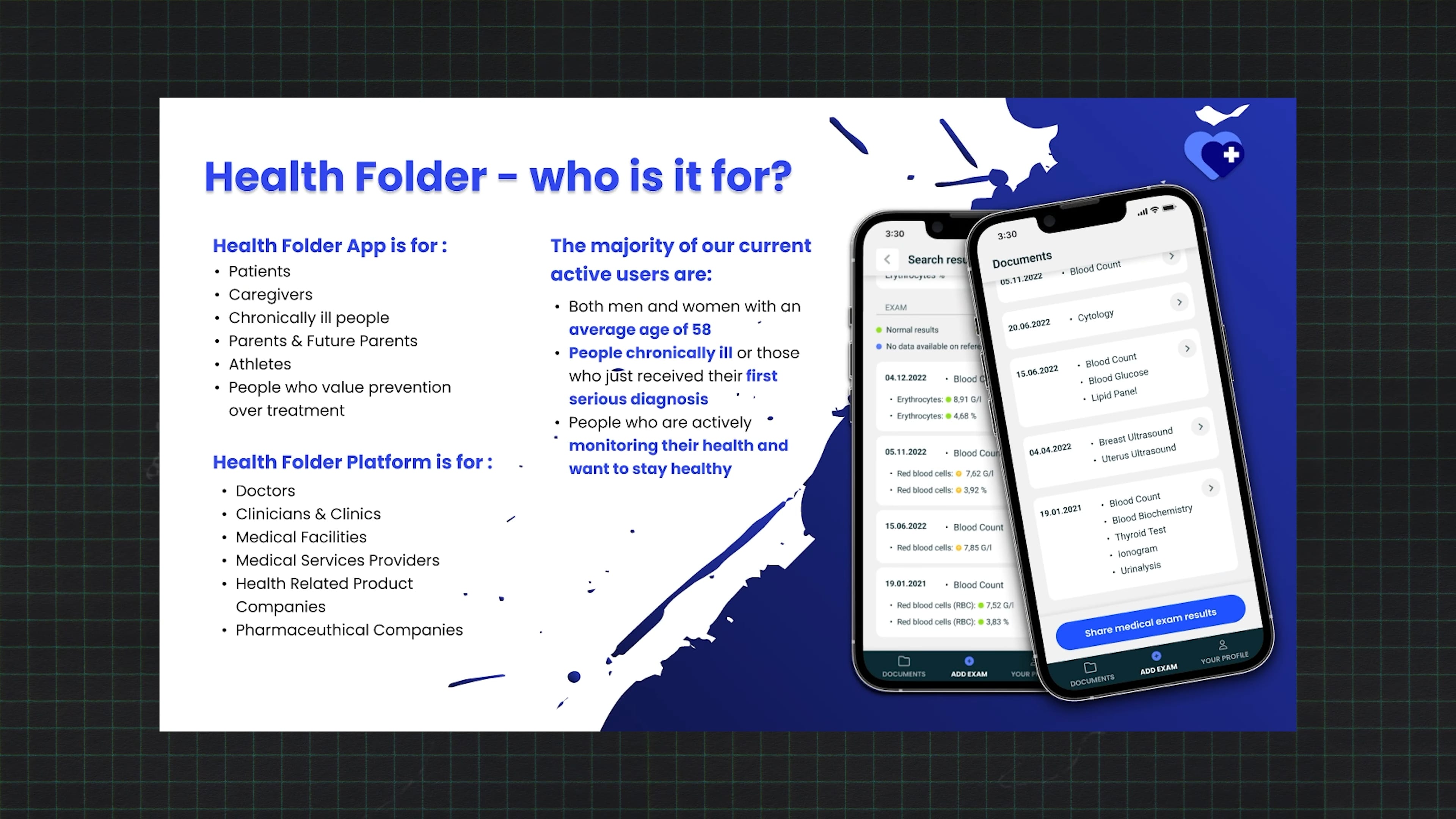
Primarily for patients, but also for doctors and caregivers.
From demographic data we’ve collected from nearly 10,000 users, we know the average age is about 58, and our oldest users are around 90.
Yes, even 90-year-olds in Poland are using smartphones to manage their health with digital records.
Then we showed who our users are, supported by demographic data – proving we know our audience.
8. Market potential

The Polish market is large – and globally, about one-third of the population lives with chronic conditions that should be monitored. Health Holder is the tool for that. Private healthcare spending in Poland has already surpassed public spending – so the private sector is strong and growing.
Then: market size – global and Polish – and our competitors.
9. Competitors
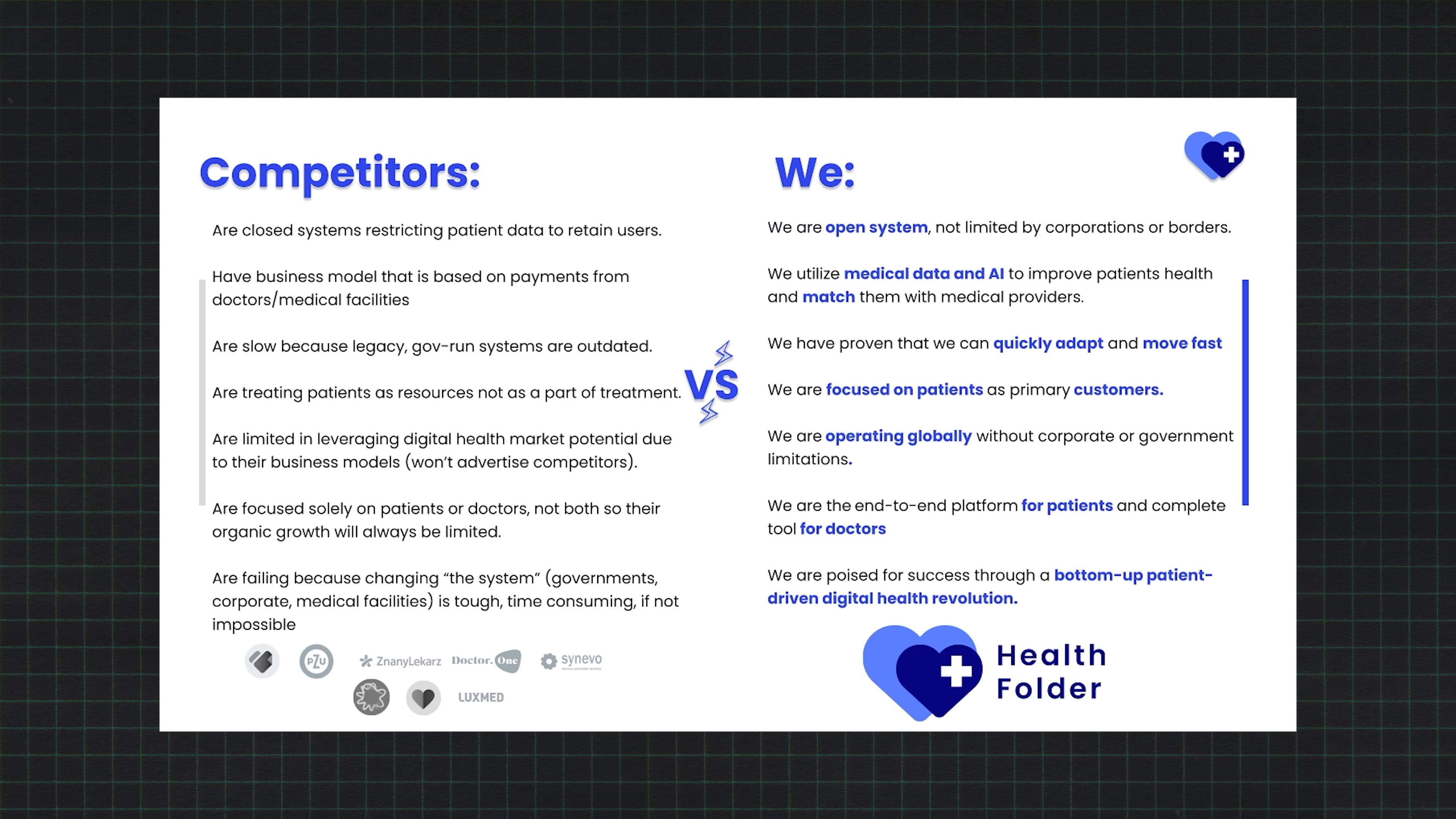
Of course, we’re not the only ones offering similar solutions. Our competitors include private clinics and potentially government systems. But our platform is completely independent – from providers, from bureaucracy – and works across both public and private systems.
We showed how we stand out.
10. Execution strategy
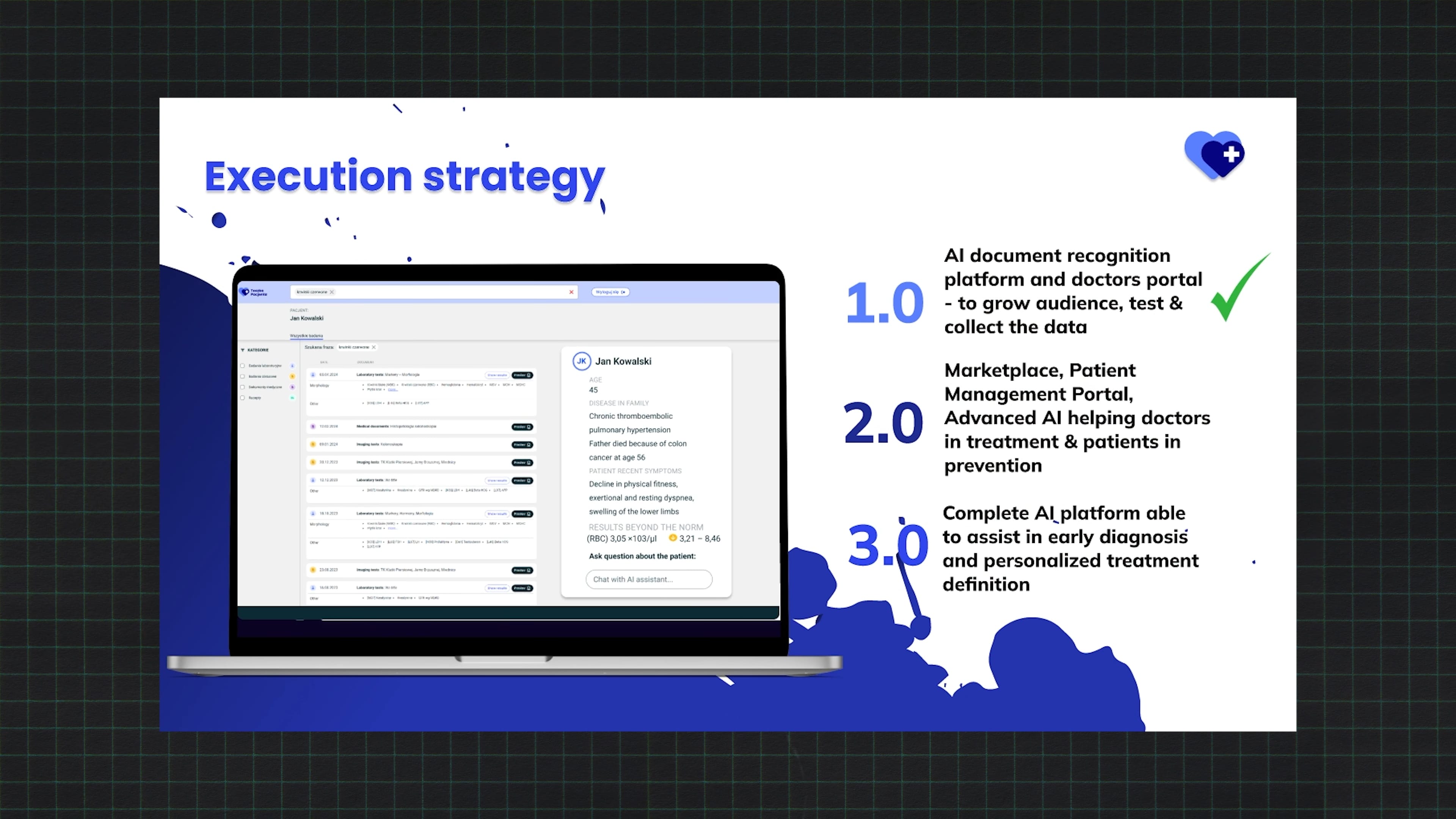
Our market strategy has three main steps:
- We’ve already built an app with nearly 100,000 users and growing. We’re collecting feedback and continuously improving.
- Next, we’ll create a marketplace connecting patients with doctors.
- Then, we’ll develop advanced AI for early disease detection and diagnostics – adding major value for all stakeholders.
After that, slides about business strategy, roadmap, and growth stages – three major milestones.
11. Business model
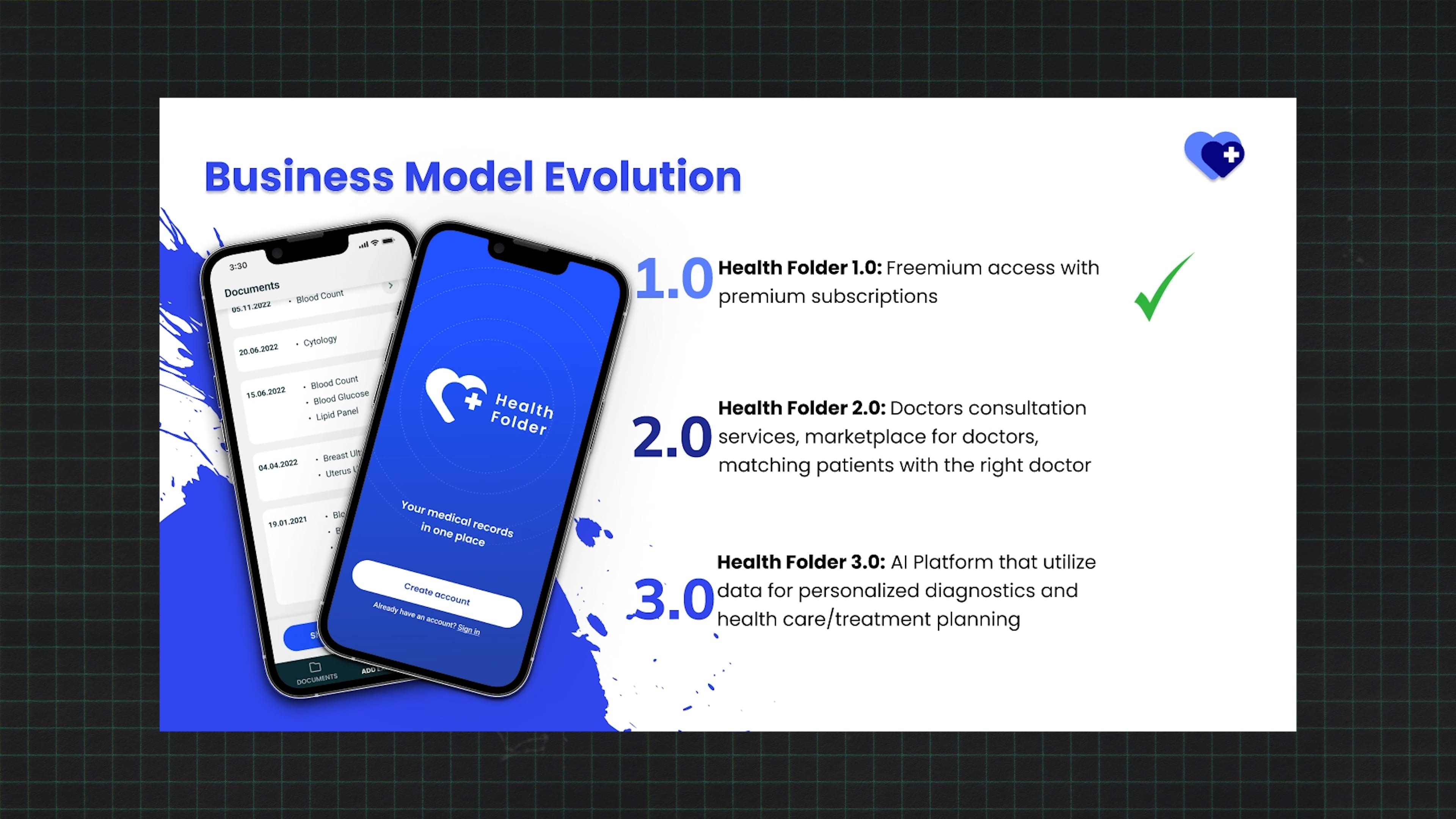
Currently, the basic version of our app is free; the premium version is subscription-based.
Next, as mentioned, we’ll monetize doctor–patient appointments. Later, we plan to build a virtual clinic to monitor patients’ health, letting them fund their own care.
12. What we have invested so far
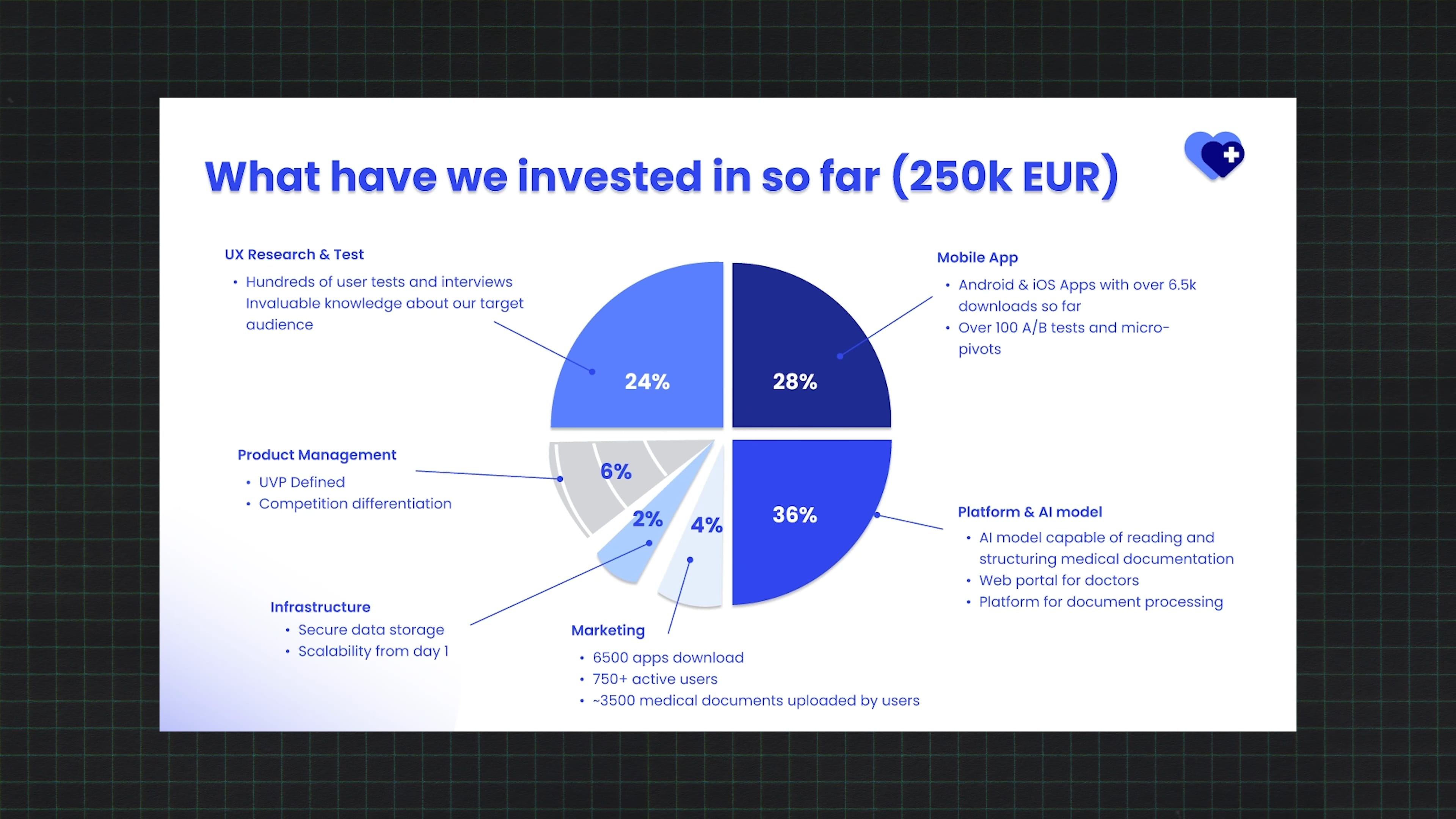
So far, we’ve invested over €250,000 of our own money – and only 4% of that went to marketing. This means our customer acquisition cost is extremely low compared to the user value we generate.
13. User feedback – traction
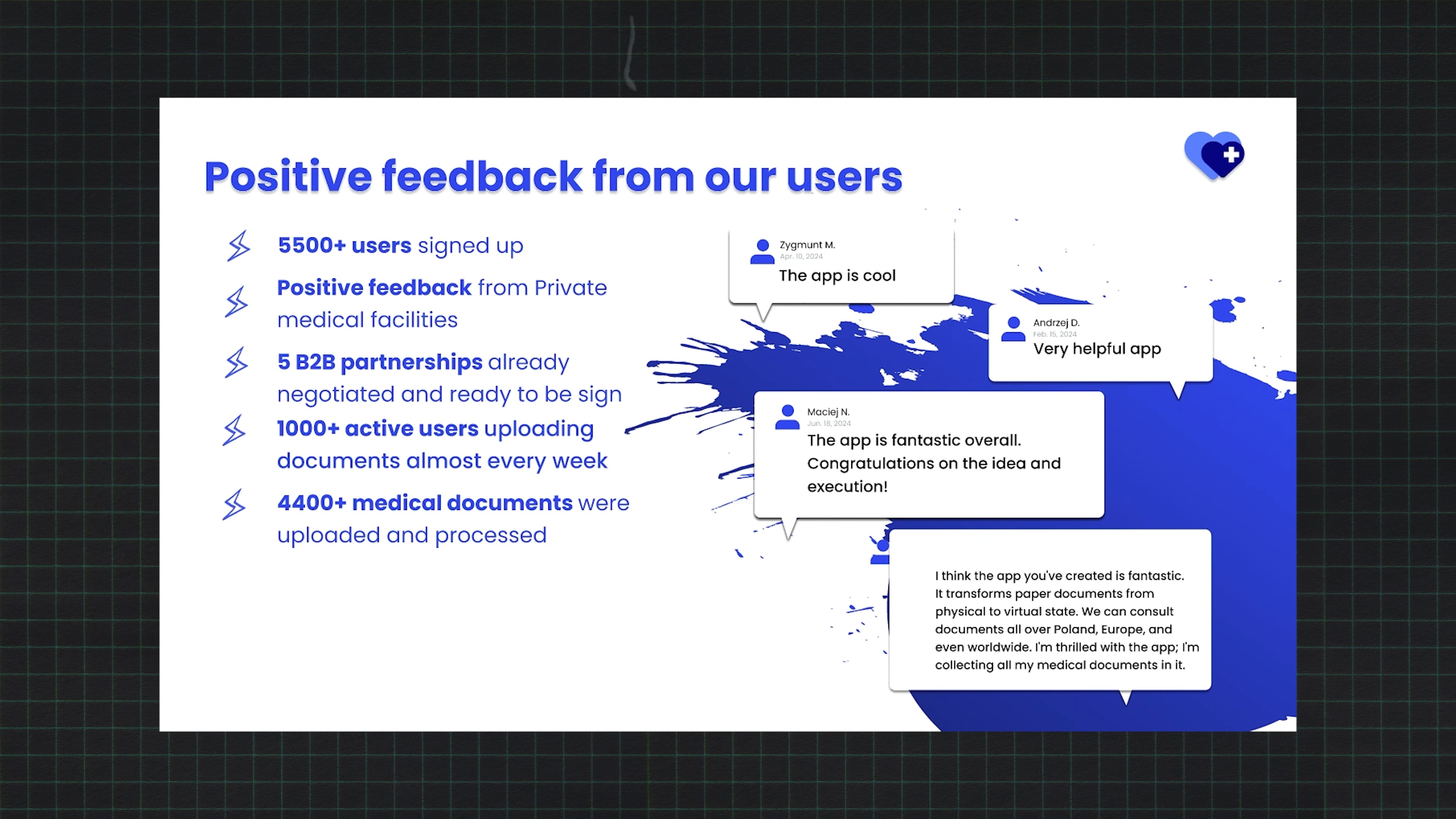
And despite being early-stage, user feedback has been overwhelmingly positive – people are using the app actively and want more. That motivates us to keep going.
Then financials: what we spent, what we achieved (users, feedback, data).
14. User Acquisition Strategy
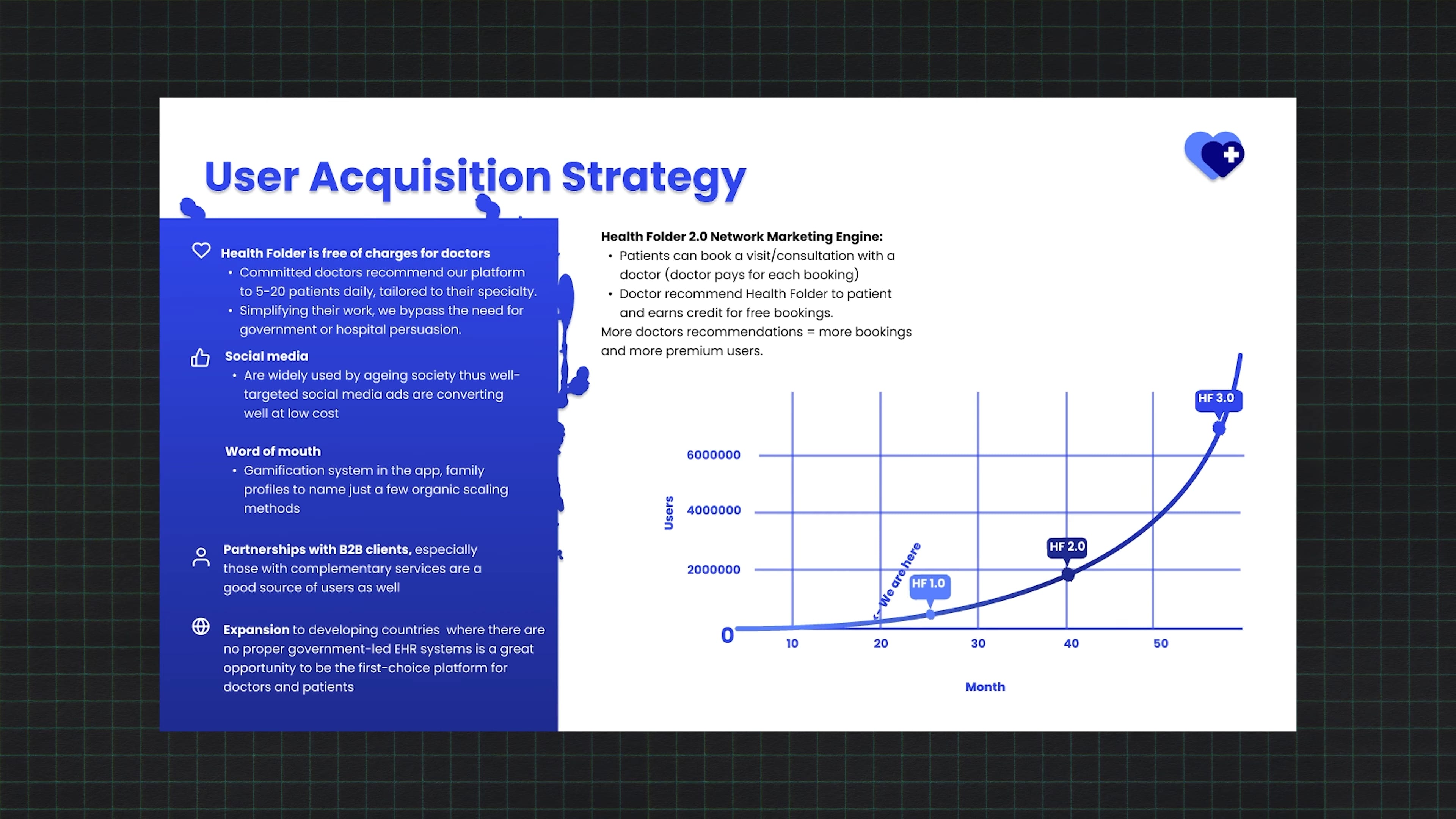
We plan fast growth – and the main driver is doctors recommending our app to patients. It’s free for doctors. Our studies show one satisfied doctor can recommend the app to 5–20 new users per day. This creates a potential snowball effect – as patients use the app with different doctors, it spreads organically.
Growth strategy – key for investors – showing how we plan to acquire users, ideally with a snowball effect.
15. Predicted revenue growth
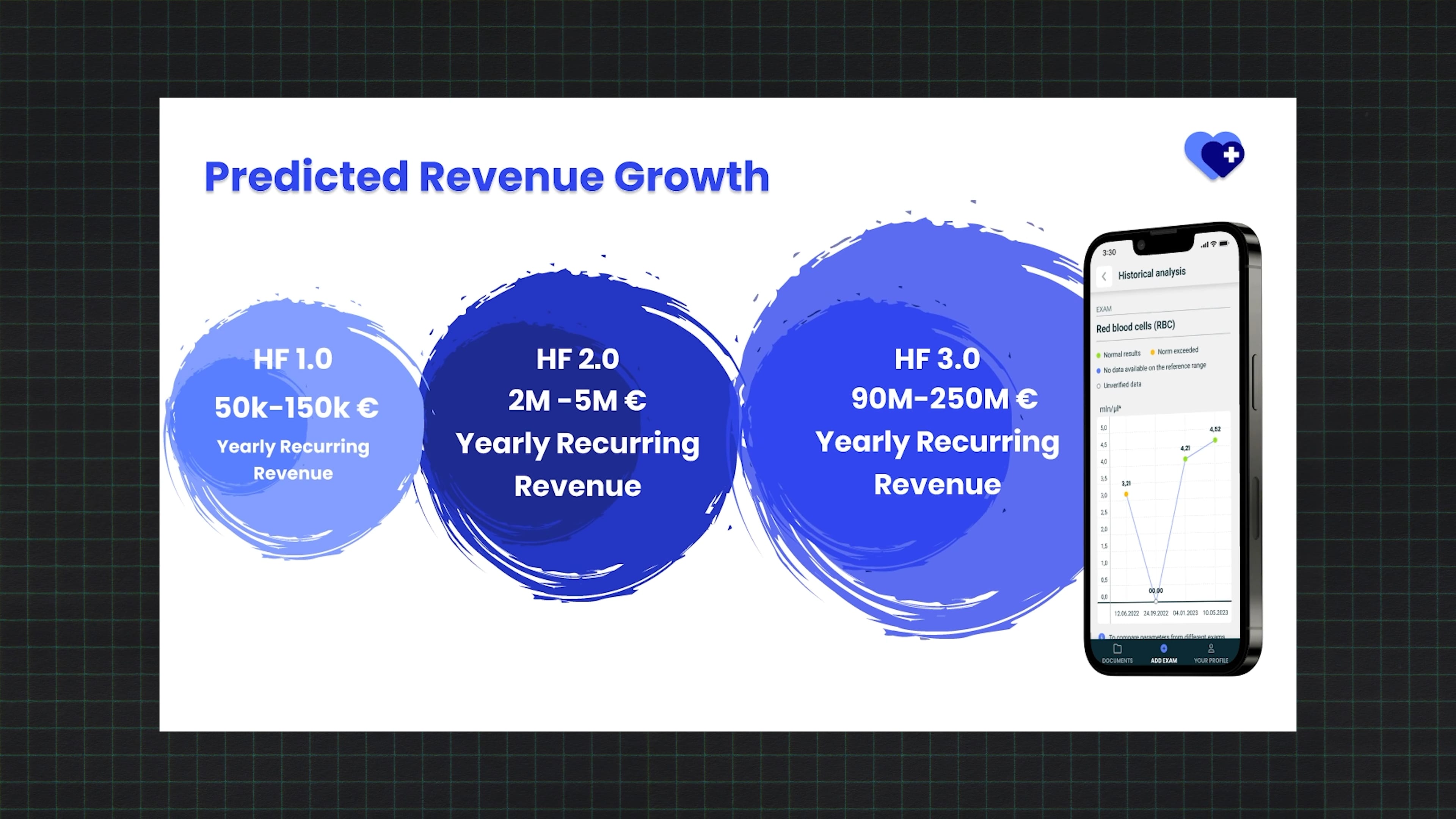
Revenue growth is directly proportional to user growth, so we expect steady increases.
Then – projected revenues and valuation (these numbers were, honestly, estimates; at that stage, it’s nearly impossible to calculate accurately).
16. Funding goals
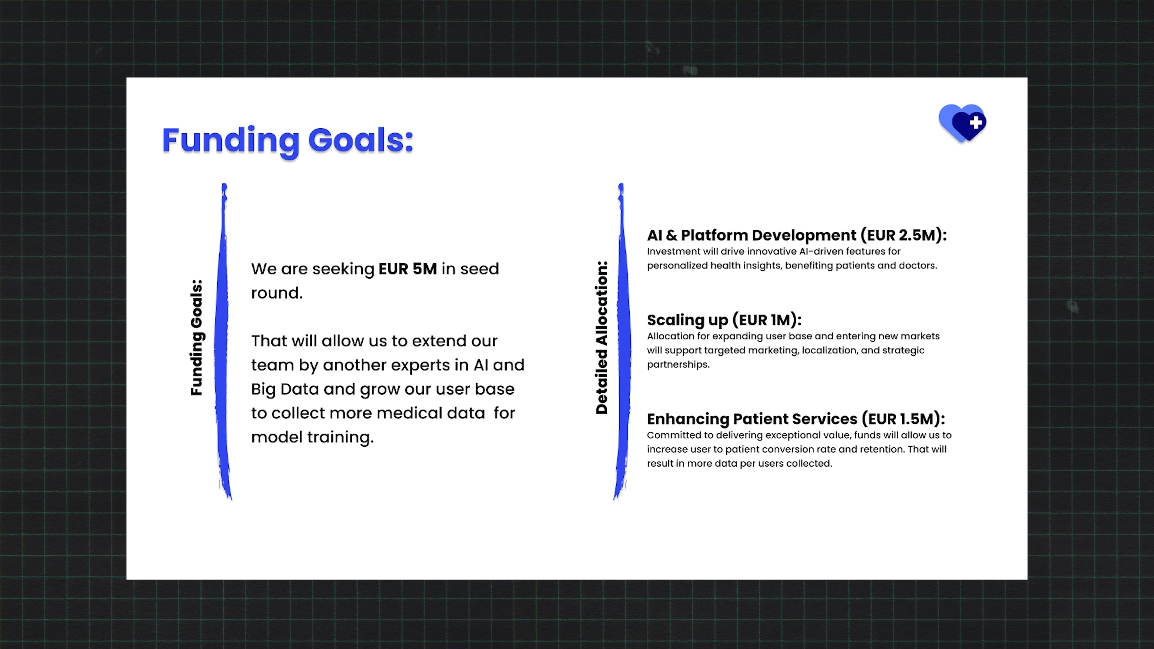
We’re currently raising around €5 million to scale our business and develop the platform and AI further.
Finally, the “ask”: how much we’re raising and what for, followed by contact info.
17. Contact
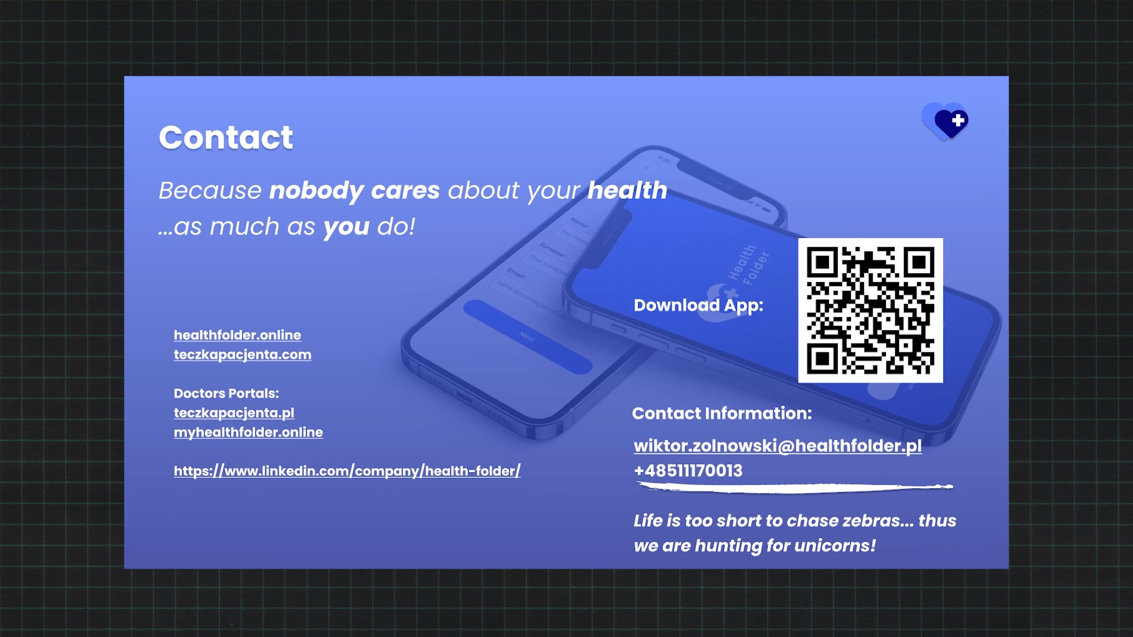
If you’re interested – reach out.
How would I improve this pitch deck?
This deck opened nearly 100% of investor doors. Only a few declined to meet.
Of course, outreach strategy also mattered – I talked about that in the previous article. But the deck was the tool – the calling card.
What would I change now?
- My deck was too wordy. It could easily be trimmed from 20 slides to 15. Some slides were unnecessary or could be simplified or moved to appendices. The competition slide had too much text – today, I’d make it more visual, add competitor logos, and keep only bolded differentiators. Same with slides on challenges, solutions, and demographics – too much text, too small font
- Our team wasn’t strong enough yet. Investors told me directly – the team needs to look complete. We had two soft commitments from funds, but they fell through. So I learned that at early stages, the team must be your strongest point. It’s worth expanding the team, adding advisors or co-founders with complementary skills.
To sum up: My pitch deck was definitely too verbose – but the content gave context and made investor conversations easier. Some read it in detail; others skimmed, but having that much info helped me refer to specific slides when needed. So while it was too long, it was also helpful.
A pitch deck has two uses:
- As a document you send to investors – where text can stay (though ideally cut by 20–30%).
- As a live presentation – where you must trim it heavily, maybe down to 5–10 slides, and say most of it aloud.
A pitch deck isn’t a one-size-fits-all document. It evolves. It should be easy to adapt. Mine started in Figma – not ideal for editing – then I moved it to Google Slides, which made updates much easier.
Bottom line
I hope the pitch and story I shared today help you build better ones. If you have questions or doubts – just reach out to us.
If you’re working on a startup and have a pitch deck you’re unsure about, you can always reach out on LinkedIn. If I have time, I’ll try to help. And if you’re looking for angel investors – reach out too, maybe your idea will be the one I decide to invest in.